Re-reading Peter York’s 1984 book Modern Times, we came to ask the question. Has it come too far?
![]() York (real name Peter Wallis), astute author of The Sloane Ranger Handbook, asserted in the chapter “Chic Graphique” that before the sixties, corporate identity was abstract. But with the advent of the design era, the artistry of the individual sign craftsman, window dresser, architect and printer was wrapped into a new professional, the design professsional, who ruled all at the company. This design man even ruled the CEO, and told him what to do. York called it Design Land. His thesis? Anytime business is slow, the company looks to “design magic” to fix the problem:
York (real name Peter Wallis), astute author of The Sloane Ranger Handbook, asserted in the chapter “Chic Graphique” that before the sixties, corporate identity was abstract. But with the advent of the design era, the artistry of the individual sign craftsman, window dresser, architect and printer was wrapped into a new professional, the design professsional, who ruled all at the company. This design man even ruled the CEO, and told him what to do. York called it Design Land. His thesis? Anytime business is slow, the company looks to “design magic” to fix the problem:
He pokes fun at the corporate redesign, a process so regular for companies today that it is a sort of drug.
“Then came the solution, the design solution, the answer to all the grim, cheesy, disorganized, 1947 reality of the mega corps’ interface with its publics — for the mega corp had many publics to be upset by a sign; sickened by a shop window. And out would come … a logo, some kind of little squiggly graphic version of the corporation initials.
“They’d explain how the logo — the sign — represented some essential part of what you did, a solution based on a wheel shape for the transport conglomerate, or how a half opened V with some stripes inside it meant printing and publishing. …
The clients would be “spellbound” and they would be presented a “manual” where they would find rules about how the new logo had to be enforced across the company. He later referenced Goebbels, and how he made sure that everything Nazi, including notebooks, had to have a swastika on it.
We think about this today, with the redesign for the classic typography of Holiday Inn (no, not the Nazi part!). We think about it for the upcoming re-branding of Northwest Airlines. We think about it in our own workplaces, where we have seen marketing staff worrying about email signatures, old and new logos on Power Points, and old stationary, as if they were lice. In the case of Northwest and Delta, the destruction of Northwest comes after a nasty buyout battle, and so the meaning is clear. We won in Atlanta. You are no longer Constantinople. You are now Istanbul. Get used to it.
We wonder. How much of this really matters, or is it, literally, window dressing? Think about it at home. Do we really need to have personal brands? Does our stationary need to be in the same font as our house number? Do we throw out perfectly good monogram towels and Sterling silver that has been handed down from grandparents? What happens if we write in cursive one day, and print the other? No, the world does not end, and people still know us. In fact, the accumulated assortment of different monograms, if historically accurate to the family, instead conveys a layering of history and authenticity. The cacophony gives a diverse and more compelling portrait. We want a clean hotel room, with good food. Who cares about the font?
Now that is not to say that we don’t like good design work. We appreciate the work of the great design firms, many of whom read www.BrandlandUSA.com. Norman Bel Geddes, Raymond Loewy and Saul Bass created value out of confusion, and we can’t get enough. But it is now 50 years later, and everyone in the design world thinks that they are Saul Bass. But of course they aren’t. And so good things, like the vintage Holiday Inn lettering, go bye bye.
This is not an argument against good taste, new signage, or new logos, or sensible evolution of brand names. Life is full of inconsistency, and often, order is needed. But we sense a new comfort with showing consumers a narrative. In fact, the new design mantra is design inconsistency. It’s all about a multi-generational story. If companies don’t claim the narrative, the public will. In an eBay, Facebook and Youtube world, consumers keep the parts of the brands that THEY like. To hell with the design police.
No One is Confused
Certainly the newest logo that appears at the top of stationary, websites and ads, needs to be consistent. But that is no reason that everything else has to disappear. This policing of old logos and stationary and signage has an anti-history feel, and it needs to go. A few examples:
- The Gap now sells T-shirts with new logos and old logos. While the signage at the front of the store is always the same, the company plays with fonts and colors on its products. There is the old gap, with its 70s groovy sans serif gap, and todays Gap. No one is confused.
- Publix, the Florida grocery chain, prints giant photographs of its early stores along the top walls above the checkout. These supergraphics are so large, they dominate the current logo, which appears, in a consistent fashion, on smaller packaging, bags and receipts. No one is bothered. It’s cool. No one is confused.
- The City of Richmond, Virginia, in their tax department on the first floor of New City Hall, displays an old board with rates for jitneys, horse-carts and the like. No one is confused.
- Walgreen’s sells a Walgreen’s store brand with an old Walgreen’s logo. While the current design is consistent, the company preserves older-brand equity with its private label products. No one is confused.
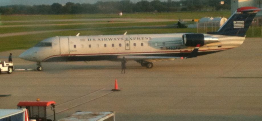
- USAirways put displays of its founding airline logos (PSA, Piedmont, America West, Allegheny) on the sides of airplanes as a merger stunt. No one was confused.
- Chrysler has allowed some dealers to keep their Chrysler-Plymouth signs up. And we still see some Oldsmobile signs at GM dealers. No one is confused.
- Hertz is using clips from old advertisements in its new ads. No one is confused
- Pepsi licenses 1970s versions of Mountain Dew logos for T-shirts. No one is confused.
- Wal-Mart has a new logo on products and displays, but hasn’t (yet) changed outdoor signage. No one cares a rip.
These are just a few examples. For us consumers, we want a narrative. Consistency is bourgeois. Every come-lately Internet start up has a pretty logo, and we all worry about branding, consistency and design, even on piddly volunteer committees. Whatever we do, product comes first. And undue attention to the window dressing must come from a position of strength.
Author
More From BrandlandUSA
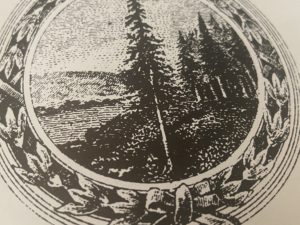 International Paper Cuts Down Its Tree Logo
 Sucrets: Since 1932, Tins Hold Answer to Sore Throats, Mystery Items
 A New Post Seizes Cereal Aisle Territory
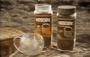 Belcrest, New Jersey Maker of China, and the Nescafe Mug
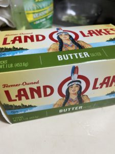 Land O’Lakes Reports Dairy Sales Decrease After Princess Removal
 Do Not Ruin the British Rail Logo, Known Around the World
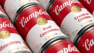 Campbell’s Soup Can Gets Careful Redesign, Goes Back to Basics
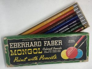 What Happened to the Mongol, America’s Most Popular Pencil?
 Triscuit Appears Without Nabisco Triangle
 Save A Lot Re-brands an Old Format
 Lasko Promotes USA-Made Fans at Walmart
 WGBH Zooms Its Storied Brand