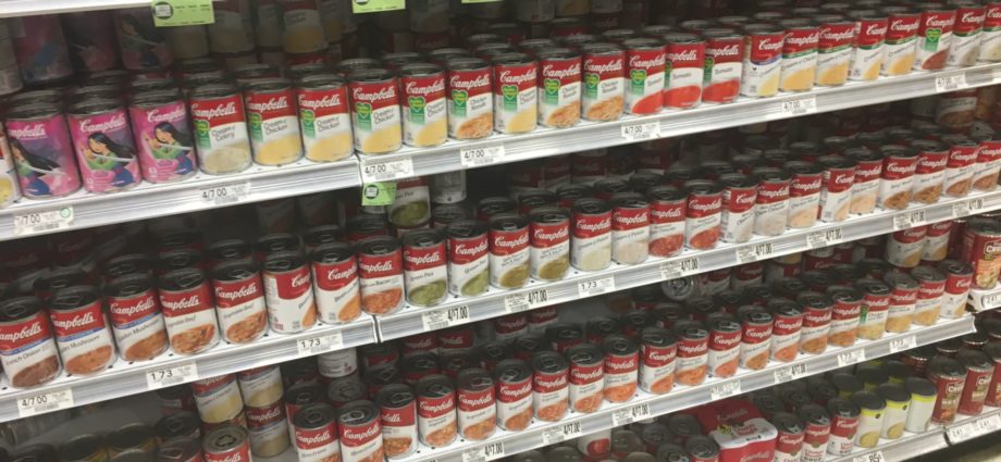
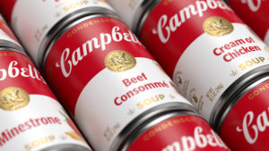
 CAMDEN – Recently, Campbell’s has been experimenting with different designs on their soup can packages. While Tomato and Chicken Noodle packages seem to be so classic they would never change (perhaps thanks to Andy Warhol), Campbell’s has tested other designs that clearly are made consumers buy more.
Put a spoon on it, and it sells more. That sort of thing.
Great story, so what’s the lesson?
Certainly, if a brand needs some sales, it is appropriate to tweak the packaging so that it sells more. But the long term way to sell goods is to get your packaging and design to a place where the product is so known that you don’t have to do tricks to make it sell. The less you have to change the packaging, the less you confuse consumers.
That being said, we can’t be seen to be complaining too about Campbell’s. They are smart to keep their “classics” classic, and then play around with other more trendy parts of the product line. In any brand mix, you want a bit of the classic, and a bit of the fashion forward. That keeps it fresh.
Just don’t get messin’ around with the Tomato, please.
Author
More From BrandlandUSA
 Sucrets: Since 1932, Tins Hold Answer to Sore Throats, Mystery Items
 Bazooka Gum Gang Chews On 75 Year Anniversary
 A New Post Seizes Cereal Aisle Territory
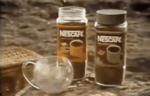 Belcrest, New Jersey Maker of China, and the Nescafe Mug
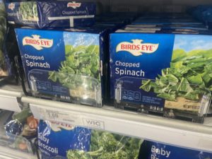 Rare Sighting of Birds Eye Frozen Vegetable Bricks
 Campbell’s Soup Can Gets Careful Redesign, Goes Back to Basics
 Redesigning an American Classic, Campbell’s Soup: Q&A with Designer Drew Stocker
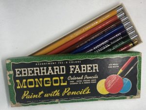 What Happened to the Mongol, America’s Most Popular Pencil?
 Lasko Promotes USA-Made Fans at Walmart
 Kentucky Senator Bourbon Gets New Shot at Life
 Historic New York Butcher Schaller & Weber Refreshes Look
 Wagoneer Finally Returns to Jeep Lineup