 VIRGINIA BEACH – One of my first childhood memories is being on the kitchen floor of our garage apartment on 78th Street, looking at a corrugated Brach’s Candy box. It had to be before 1969, when we moved to a real house, and my parents got out of the business of beach cottage rentals. I would play on the floor of the kitchen and one day I looked under the sink, and there was that Brach’s Candy box. I believed it was full of candy, but they showed me, and they had to prove that there was no candy there. Even after they showed me, I would look to see if somehow Brach’s appeared.
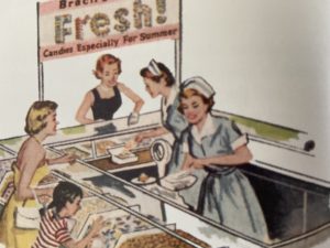
It was before I could read, so I must have connected the images I saw at our neighborhood Be-Lo store Brach’s Pick-a-Mix display with the logo on the box. (Be-Lo, headquartered in Virginia Beach is now owned by www.freshpride.com. The Be-Lo brand could do with a bit of nostalgic freshening, as well, btw.) Pick-a-Mix was the legendary grocery display where you could dish up your own assortment.
I recalled that memory today when looking at the new Brach’s candy logo. It’s not good, and keeps none of the block lettering that has been its design scheme for at least the last 50 years. A few years ago, they jazzed it up a bit, but now they have discarded that legacy with the new design under the brand’s ownership by Farley & Sathers. The story of the redesign is posted on the company website.
Under Farley’s & Sathers, there is investment in the brand, which is what it needed. The company was sold out of family ownership in the 1960s, and under American Home Products it was sort of ignored, but preserved. By most accounts, Raider Klaus Jacobs pillaged the company, which once employed 3,700, but at least he was wise enough to see some value in the brand. I will give him that. Look here for his foundation; perhaps it could invest in a run-down neighborhood in Chicago? Funding Universe says a major mistake was reducing SKUs from 1,700 different candies and packaging types and sizes to only 300 SKUs.
The tragedy was that the company had a Wonka-like candy factory in Chicago, and an iconic status that was connected to the plant. The factory ruins are the subject of great interest, including a View Master version created by Wurlington Brothers Press. But the brand was stronger than the corporate vampires, and Farley’s & Sathers wisely found value in Brach’s, and decided to invest. Farley’s is a company to be trusted; they have preserved Chuckles packaging pretty much as it was. They also own other classic brands like Fruit Stripe gum and the Heide brands which include Jujyfruits and Jujubes. Thankfully, they have preserved Heide because it was so connected with its products.
The company, in an article published by Candy and Snacks Today, contends that the design change harkens back to an earlier time, when the purple dominated. That’s good. The company also said in the piece that they made the changes with intensive market research. The article quotes a consumer who said that they’ve actually had people in focus groups cry. The article also has a declaration that private capital status of Farley’s doesn’t mean that it is for sale. All good.
In an magazine interview back in the 1980s, graphic designer Lou Dorfsman told of a time at CBS when that network almost eliminated the eye logo. Smarter heads prevailed, but the episode is proof that good work (and the decades of public goodwill that it stirs) can be easily destroyed by the unthinking.
Brand relationships are formed over the years, and when companies nurture those images and connections, customers feel that the product is consistent. When they screw with the images and brand design, it tells the consumer that things have changed. Sometimes, brands need to be tweaked; this is a delicate process and it shows the older customers that the product has changed, but then makes the product attractive to new customers. But when it changes too much, and the actual factory even changes, customers begin to wonder…is this the same product that I loved, or not?
No matter what happens, however, if a brand is still in business, and still has sales, mistakes in packaging are easy to correct. In fact, time begins to fix errors, and what’s new today is old tomorrow, and when the new becomes old, companies can easily go back to classic.
See what you think. Is the new package design better, or not?
Logo History of Brach’s
Below, an early version of the logo from the now-shuttered factory in Chicago. This image was posted on Ken Faber’s excellent blog on gritty American history, American Urbex, at americanurbex.com.

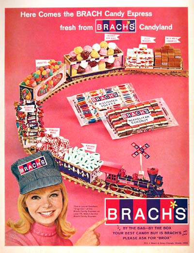
Below, the 1960s look of the brand. The concept is a bit cheesy, but earnest (more ads online at CandyFavorites.com):

Next, the revised version, familiar to many today. It is patently awful, with a horrid smiley face in the middle. Good riddance:

The current design.
![]()
Love some reader thoughts; you can comment before you shop from the obligatory ad for Brach’s on Amazon.
Author
More From BrandlandUSA
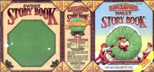 Petition Asks for Rescue of Traditional Life Savers Sweet Story Book
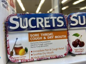 Sucrets: Since 1932, Tins Hold Answer to Sore Throats, Mystery Items
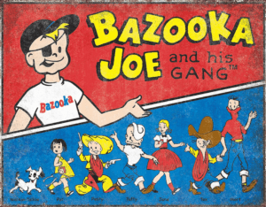 Bazooka Gum Gang Chews On 75 Year Anniversary
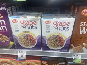 A New Post Seizes Cereal Aisle Territory
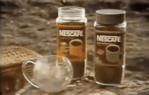 Belcrest, New Jersey Maker of China, and the Nescafe Mug
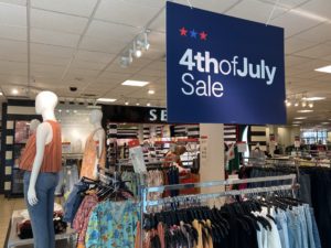 Store Visit: JCPenney Tuned Up for Shopping
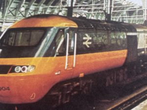 Do Not Ruin the British Rail Logo, Known Around the World
 Candy Corn by Brach’s, Once One of America’s Largest Candymakers
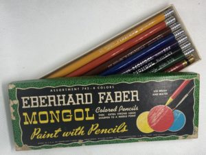 What Happened to the Mongol, America’s Most Popular Pencil?
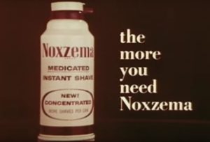 Discontinued Noxzema Shave Now Up to $150 a Can in U.S.
 Lasko Promotes USA-Made Fans at Walmart
 Company Brands, Trademarks and Product Brands
Oh, and I can’t resist saying that the ad with the owl is a “hoot.” Also, quite effective is the ad saying Brach’s is “good enough for silver.”
its here if readers want to see it..
http://www.candyfavorites.com/shop/brachs-candy-ads.php
Jon…thanks for posting the link to the old candy ads…and grateful that you’ve been affiliated with them so long.
Marvelous article! As one of the nation’s oldest Brach’s candy distributors, we have seen many of these design changes take place! If you are looking for Brach’s Candy, please go to http://www.candyfavorites.com/candy/brachs-candy and don’t forget to check out our gallery of Brach’s Retro Candy Advertisements which can be found at http://www.candyfavorites.com/shop/brachs-candy-ads.php
Kudos for a great article!
Best,
Jon H.PRINCE
President
Actually, there was another logo revision missing here. Before the one you dislike so (the one with the orange slices) that I think is pretty nice, there was a much worse redesign. After digging, I found it here:
http://www.bradkent.com/?page=wrappers/co-contacts
Scroll down about half-way down and you’ll see it. This was about 10 years ago. Pretty awful, huh? So, the one you dislike so was actually a vast improvement than this!
Great thinking on this, Garland ! Thank you.