In retail, national retailers always resist local planners in order to push a uniform brand identity. But the subtleties of each retail location should be recognized. While a retail brand needs to use uniform colors, the way the brand appears on each sign is a bit of local connection. If you do it well, the customer understands that you understand their community. If not, things seem off.
The challenge comes when you have older buildings, either historic or non-historic, but vintage. The common approach is to erase as much as you can of the story of the building, and put in new.
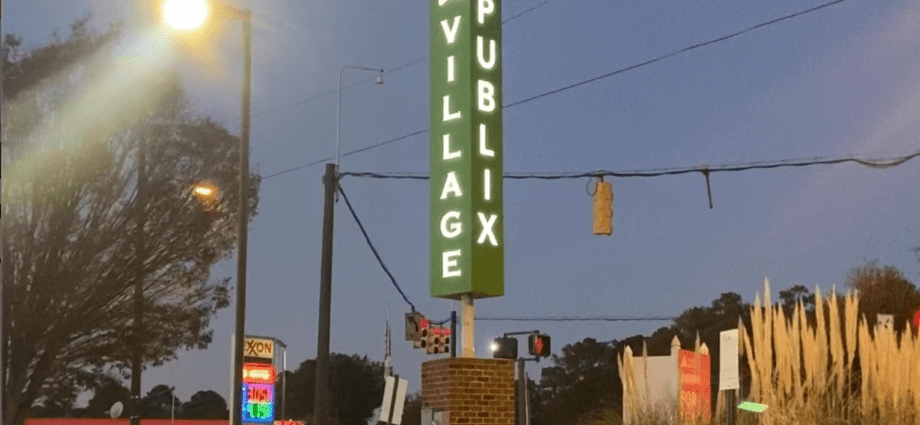
Pictured here is an example from Publix, the grocer, in Virginia. The Lakeland, Fla. grocer has a series of musts in its stores, from the signage fonts, to colors. But within that framework, there are many options.
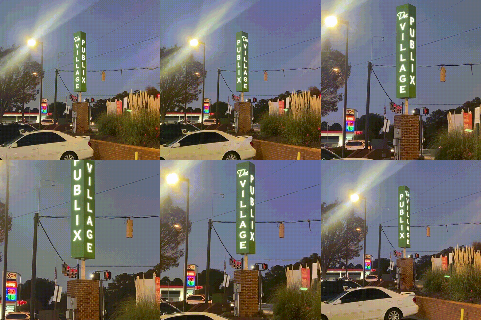
Richmond, Va. was a destination far away from their home markets of Florida and Georgia. When they entered the market, they inherited stores from Martin’s that had been repurposed from Ukrop’s, which was a beloved local grocery chain. One of the stores was at The Village, in a 1950s shopping center that had tiny parking spaces, all situated on a tight hill. Signage was limited, and already in place. One of the chief features of the shopping center was a square, revolving sign.
The site had other difficulties, but was a must because of the household income in its zip code. The parking is tight, not leaving room for wide signage and street front landscaping. The site is also in two jurisdictions, as it is on the border of the City of Richmond and Henrico County.
The moving sign is something that local planners often disallow; if there is one already in place, a retailer does best to try to fit into what is already there and use it. Revolving signs also often do not work; that this one is turning makes it memorable.
Publix opted to make its logo fit the local idiom, and won for itself an effective local branding campaign.

