Consumers across the U.S. are seeing carefully tweaked Campbell’s Soup cans at grocery stores this fall because of a once in a lifetime redesign. (Full story HERE).
Consumers may or may not notice the updated look, designed by the graphic and product design firm Turner Duckworth.
The challenge is that Campbell’s needed to update the design, to accommodate changing tastes. But at the same time, it could not alienate the millions of consumers who like Campbell’s just the way it is. Consumers have millions of positive memories seared into almost every American hippocampus. To mess with things too much would destroy goodwill earned diligently over 125 years.
The agency Turner Duckworth was tasked with the redesign. BrandlandUSA Editor Garland Pollard asked a few questions of Design Director Drew Stocker to find out the background, and put in context what it is like to rework what is effectively a piece of Americana.
Q: Will the design appear in all markets?
STOCKER: This design is being rolled out in the US market.
Q: Is the red the same? What red is it? It seems brighter but I am sure the shades have evolved over the years, and especially with digitization.
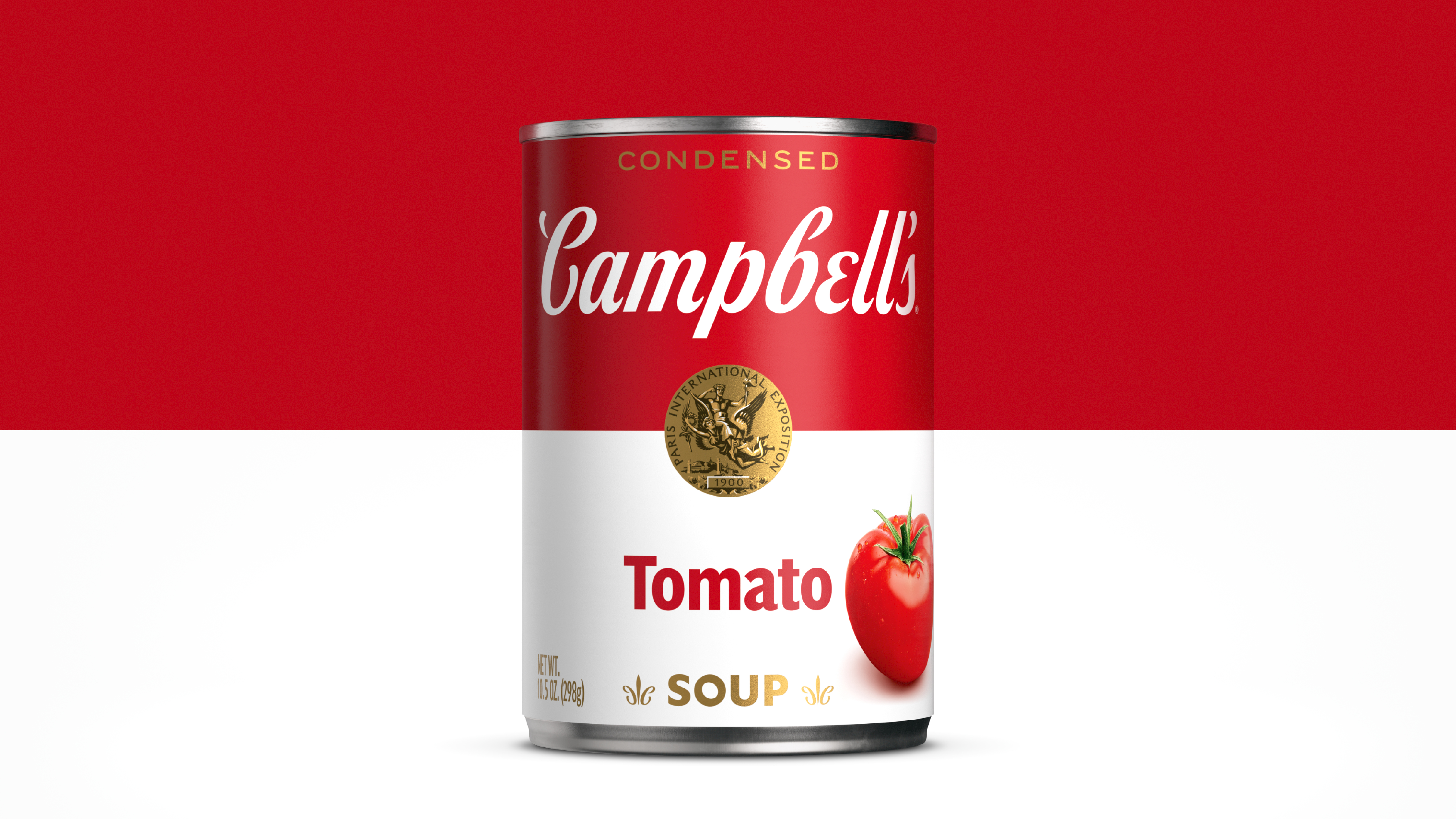
STOCKER: The iconic Campbell’s red is a custom mix that we have kept the same. What we have changed is how that red is used in conjunction with other assets, such as the Campbell’s script, to optimize the overall brightness and freshness.
Q: How was the collective shelf look addressed, especially with other Campbell’s soup Well Yes brands out there?
STOCKER: Campbell’s red & white condensed is the foundation for the Campbell’s soup portfolio. We set out to create strong shelf blocking by establishing a consistent framework that provides flexibility in communicating a range of healthier SKUs, including Healthy Request. This foundation is meant to help inform optimizations to other Campbell’s soup brands down the road.
Q: When did you all get the charge to update the main brand? And was that a bit daunting?
STOCKER: We won the business as part of a larger creative agency pitch with Publicis Groupe. Our track record of applying just the right touch during the delicate business of redesigning iconic brands, assured them that we were the right partners for the job. While it’s never easy to change an iconic brand, our experience with revitalizing brands with a rich history such as Coca-Cola and McDonald’s made the task ahead of us less daunting.
Q: How much does the whole Warhol aspect play into it, ie. there was the original brand, and then the “icon” aspect that the world associated with it?
STOCKER: Campbell’s is arguably the most famous brand in your pantry at any given time. The downside of that is that the brand comes with a sense of nostalgia and comfort, which doesn’t always translate to relevance. While retaining the iconic label architecture made even more famous by Andy Warhol, we thoughtfully contemporized every detail so that the can feels at home on any kitchen counter.
Q: Does the Campbell’s product brand also mean that the corporate Campbell’s is tweaked as well?
STOCKER: The brand is moving towards implementing assets such as the script through their entire product range.
Q: The tote bag, with red and white Campbell’s label, echoes a longstanding Campbell’s interest in its related products, what some now call “merch.” Was there thinking on the product aspect of Campbell’s with the design?
STOCKER: Our focus was on crafting a new foundation for the future of the Campbell’s brand, with a laser focus on the packaging itself. One of the most challenging parts of this assignment was the idea of scaling an icon to 100+ SKUs. But pack design itself can be limiting when you need to communicate bigger ideas. We created a supporting visual identity for agency partners to use, including a broader, food-inspired secondary palette, a warm and welcoming illustration style, and the expansion of a typographic voice to communicate all of the good things the brand needs to say. We are excited to see the brand continue to flourish over multiple channels with multiple agency partners.
Q: As far as I know, the Campbell’s kids have not reappeared? Are there other aspects of the brand that you all are reworking?
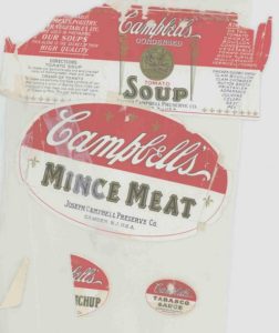
STOCKER: The Campbell’s Kids themselves are not an asset that we wanted to change. We learned a lot in our initial immersion with Campbell’s, and were fortunate enough to take a peek into history with their full-time brand archivist. Through that experience, we were able to cherry-pick from the best of the past 150 years to influence our thinking. In the word mark, we found a way to retain the DNA of Joseph Campbell’s original signature while giving it a contemporary, less fussy look. Decoupling the characters in particular gives us much more flexibility in how and where the logo can show up and retain its impact.
The fleur de lis is a tricky one. On one hand, we were tempted to retire it as it’s a generic symbol, one added by the founder to be a competitive Franco American brand. On the other, it’s a critical part of the overall label experience that you miss when it’s gone. To connect it better to the brand, our design team had the discovery of drawing it out of Cs from the wordmark — a moment of delight and discovery, and something that is often found in the work we do at Turner Duckworth for our clients.
- Find out more: A full story of the redesign is HERE.
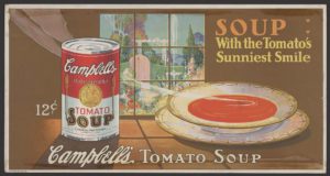
- Below, the two Tomato Soup cans. Use the slider to view both.


 Forgot Reopens in Cumnor, Va.")