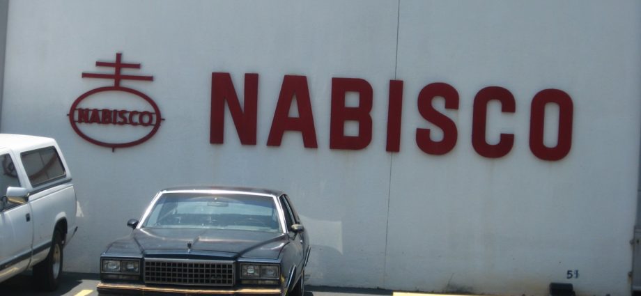
 If ever there was a reason to stick with a strange logo no matter what, take a look at this Nabisco logo, pictured above. It is from the side of a warehouse in Pensacola, Florida. It works. It describes the Six Rules of Company Brands. The company brand is an ignored aspect of branding in the U.S. Companies dump their company brands, and wonder why their product brands are suffering. Consumers read labels, and know. Because of this it is important to keep these brands around.
1. Stick with it for a long time, and folks will get used to it, even if it looks like a logo for Spacely Sprockets. Nabisco is no longer the company, but it identifies an array of products. Good company brands that are no longer companies include Milton-Bradley, Ideal, Cheeseborough Ponds, Richardson Vicks, McNeil, Mennen and Shulton. Keep these brands on the packaging, even if the end product changes.
2. Always make good products, some with lots of sugar, and some with lots of salt. (Oops, this isn’t a brand rule. It’s a junk food rule. But it applies. A bad logo with a good product wins.) If the product is good and consistent, it can stand to have an odd logo.
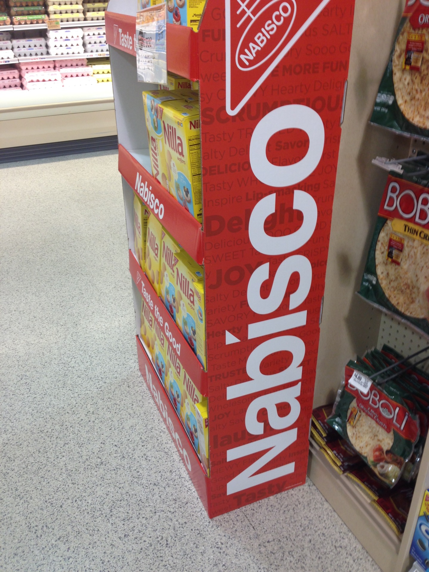
3. Use separate brands for each of them, but also connect those new brands to the old master brand. So the Master brand “rules” the slave brands, that include Triscuit, Chips Ahoy, Ritz, Uneeda, Fig Newton. Do not use a brand on its own, without a master brand.
4. The company on the box can change, but leave the brand. So once there was Ritz brand, made by Nabisco brand bakery, made by Nabisco company, that is no more. Now there is Ritz brand, of Nabisco Bakery, owned by Kraft. Kraft appears in small text on the back of the box. There is room for all brands. But don’t sell Ritz without the Nabisco, even if Kraft changes and some hedge fund comes through. It won’t work.
5. If there are tweaks and changes to the logo, don’t make all of your dealers change all the logos on small buildings. A bit of narrative is good. Cookie eaters are smart enough to understand that design evolves, and to have slightly different versions of the design around helps consumers know that the brand has been around for a long time and has the strength of history. Plus all the time enforcing brand standards on little guys or small offices sends the wrong message. It’s a freaking waste of time, this whole process of rooting out old stationary with the “old look” for some anal “consistency” program dreamed up in some not very good branding office in a faraway place. Any bank teller will laugh in the face of the sign guy, who comes through every year to change the brand with new signs.
6. The early 1980s Chevy Monte Carlo was not a good looking car. But it sort of became interesting. Lots of things become more interesting as time goes on. Including a sort of circle with two squiggles on top.