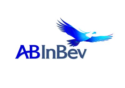
St. LOUIS – So AB Inbev releases its new logo, just after its takeover of Anheuser-Busch. At the same time, it is preparing layoffs. These layoffs were in preparation just before Christmas. According to AP, there are to be about 1,500 fired. Apparently, some were proposed before the buyout, but we know that realistically, buyouts (and re-brandings) are paid for by letting people in headquarters go. It says on its site that the new identity: 
“reflects the vision of our new organization, with our guiding principles at the very heart of its conception. It is designed to represent drive, authenticity and friendship. It is also meant as a source of pride, which aims to motivate and inspire employees, engage with partners, and demonstrate our ambition to become The Best Beer Company in a Better World…. In summary, the new identity is meant as a beacon of a bright, vibrant future for employees, customers, consumers and the communities where we work and live.
The logo isn’t the worst ever, and we are heartened that the eagle survived. It appears on the main AB InBev site as brown, though the download version is in shades of blue, much better.
The reality is that a brand, and a new identity, can’t gloss over bad things. Or it is a cruel joke, and becomes a symbol of what is hated. So in the end, it’s not a good logo. And to call it a “better world” just doesn’t compute. Layoffs in a buyout might be the world we live in now, and it is hard to get too angry about as it is so prevalent, but it is not a “better” world.
In addition, InBev might have done better to leave Anheuser-Busch as a company subsidiary brand, and leave the logo the same.
The St. Louis mayor Francis Slay put it well in a quote from the St. Louis Business Journal:
“Anheuser-Busch has been brewing beer in St. Louis since the 1860s. It has endured a civil war, Prohibition, a couple of world wars, labor discord, diversification, and plenty of national and international competition for market share.
Interested in reading more about Anheuser-Busch and its branding? Read our BrandlandUSA posts on Anheuser-Busch:
A friend who alerted us to the change had his thoughts, saying that it looked like the Rescue Hero eagle, slightly cartoonish. “I always ask why buy something that is working and then change it to something that is unproven. A brand is all about being consistent in the message and the value.”


The logo is a subtle way for InBev to say “we’re getting rid of the eagle”. You can bet that the next incarnation of the logo won’t even have an eagle in it.
There was a reason Anheuser-Busch was the best beer company in the U.S. It’s because they knew what they were doing and what Americans liked. Now the new company is throwing the baby out with the bath water (along with the eagle). You won’t find one U.S. blog in the world that praises the purchase of Anheuser-Busch by InBev, but you sure will hear a lot of complainers.
InBev has no idea how Anheuser-Busch operates. You can tell by the video at the combined A-B InBev site at http://www.ab-inbev.com/ that the gloating CEO, Carlos Brito, only cares about his company being big, just like Worldcom, Enron, Parmalat, and AIG that went before.
Carlos Brito is a one trick pony that’ll will keep doing stupid things because he’s too one track minded. Kind of like the like the outgoing U.S. president.
It’s not too bad. And AB certainly wasnt above laying people off. So at least the eagle and “AB” remain.