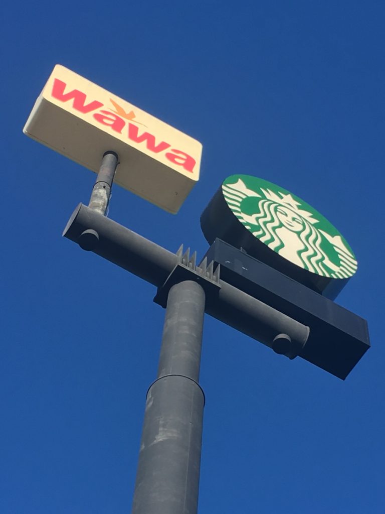
The new Starbucks logo has removed the word Starbucks. Many do not get it. We talked to a veteran branding executive, Allen Adamson of the New York office of Landor Associates, to get some insights.
BrandlandUSA: What do you think about the changes?
Adamson: The changes strengthen Starbucks’ branding. They make it simpler and bolder and in today’s complex, cluttered environment that is a good thing.
BrandlandUSA: Do companies too often rely upon logo modifications to fix strategic problems?
Adamson: A logo is a signal – a way to tell the marketplace your story. If a brand has a new or enhanced “story” to tell, then a logo change can help do that. If the company’s “story” has not changed, or they still have strategic problems, changing a logo won’t work and could actually make things worse.
BrandlandUSA: Does all this matter or is it just Starbucks hype?
Adamson: Branding and logos are long-term tools to better tell a company’s story to the marketplace. If the new mark breaks through marketplace clutter better, and the dropping of “coffee” lets them broaden the brand over time it, then the change will matter and be more than hype.
BrandlandUSA: Do you see any risk in the change?
Adamson: There is always risk in change. Will the brand lose some authenticity? Maybe. But in this case I think the benefits will outweigh the short-term risks.
BrandlandUSA: Starbucks kept the sea nymph, but so many companies drop their iconic images in favor of text. CBS, at one time, almost dropped the eye…but then had better thoughts. What’s the value in the icon?
Adamson: A good picture (icon) is worth a thousand words. Pictures communicate much better than words especially in a global marketplace.
BrandlandUSA: Is the language the big issue with Starbucks, in that they are trying to be international?
Adamson: English does not hold a brand back from being global these days. But a simple bold icon for a brand like Starbucks often works better on a global stage.
BrandlandUSA: Starbucks tends to run counter to the minimalist trend of many logos in the last decade.
Adamson: Yes as it was tied to their authenticity. But I think this solution lets them have the best of both worlds.
About Allen Adamson

Allen Adamson is managing director of the New York office of Landor Associates and author of BrandDigital: Simple Ways Top Brands Succeed in the Digital World and BrandSimple: How the Best Brands Keep It Simple and Succeed.
Responsible for all aspects of the New York office’s operations, Allen has overseen branding efforts for a broad spectrum of corporate and consumer brands in industries ranging from technology to health care to fashion. Under his leadership, Landor’s New York office partners with a wide array of clients, including Citi, Diageo, General Electric, PepsiCo, and Verizon. Additionally, he counsels professional organizations including Council on Foreign Relations, the National September 11 Memorial & Museum, and the UNCF.
Allen writes a bimonthly column for Forbes.com. He has appeared on NBC’s Today Show, CNBC, and the Fox Business Network. He is often quoted in publications such as the Wall Street Journal, Advertising Age, the New York Times, USA Today, the Washington Post, and Forbes. He regularly lectures at numerous universities and business schools.
In 2006, Palgrave Macmillan published Allen’s first book, BrandSimple, which is based on the premise that the world’s leading brands are built on clear, concise ideas. Translated into three languages, BrandSimple is a culmination of Allen’s more than 25 years of industry experience and details how brands can break through in a world of communication overload. BrandDigital followed in 2008 and expanded the premise of his first book by explaining how the ever-evolving digital marketplace has magnified the basic principles of building powerful brands. Allen interviewed more than 100 of the best and brightest people in the fields of marketing and technology to outline best practices for the digital era. Before joining Landor, Allen gained branding and marketing expertise on both the agency and client sides. During his time as senior vice president, group director, at Ammirati & Puris and DMB&B, his clients included Kraft, Mars, and Procter & Gamble. He also worked at Lever Brothers, where he was group product manager, responsible for a number of major brands. His career began at Ogilvy & Mather in 1979. Allen received a BS from S.I. Newhouse School of Public Communications at Syracuse University, and an MBA from New York University’s Stern School of Business.

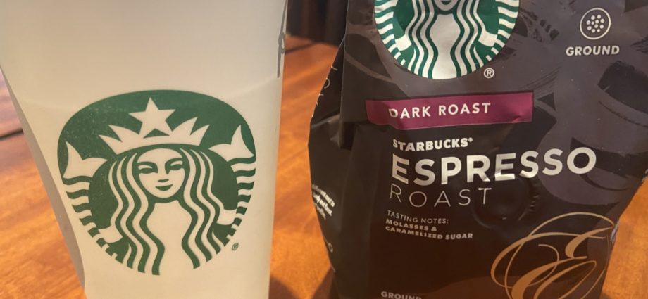


Wait, what? Lacking before and after images, I thought
Starbucks just now dropped the ‘Starbucks’ from their ‘logo’,
leaving only their sea nymph artwork as their so-called ‘logo’. I
can understand their having dropped ‘Coffee’ to reflect their
broadened product line, but are English and American company names
so reviled now in this brand-new post-exceptionalist era that the
American company name, a big part of the brand that carries so much
equity, now must be eschewed? Is the name, ‘Starbucks’ so
ubiquitous that it need not be written down? Even Coca-Cola doesn’t
just make do with its sinewy swoosh. I think Starbucks feels it’s
just too hip for the global room.