LE SUEUR, Minnesota – There are few canned vegetable brands that command a premium, but Le Sueur “very young small sweet peas” are one of them.
Charging a premium for a straight basic commodity is a challenge. To make a premium brand out of a commodity, you need years of brand goodwill earned from a great product history, a tasty product, snazzy packaging, strong marketing and consistent distribution. At the same time, and over generations, you need corporate leadership that does not cut corners on the product. With a straight commodity, it is easy to cut corners; find a cheaper pea supplier, and no one will notice, that is, at first. Also over generations, you need corporate leadership that keeps the brand consistent, and does not muck with perfection.
When you have a brand that is perfection, what you want to do, as a company, is keep it the same and enjoy the process of producing the product. In the case of canned peas, each part of the production should be a pleasure, and should add value to the final product, with each group of employees enjoying the process.
Growing good peas. There is reward in that.
Carefully processing and running the canning operation to high standards. There is reward in that.
Planning and supervising tasteful marketing that affirms the value of the product. There is a reward in that.
Selling the product at a premium. There is reward in that.
Eating them. The ultimate reward.
I was introduced to the excellence of Le Sueur back in the 1970s; my childhood friend in Virginia Beach, Russell, swore they were the best, and there was no other brand. They were always sold at a premium price; what set them apart was they were little, they tasted sweet and the can label was rich looking. There was nothing chewy about them; when you ate them, they had been cooked to a soft luster. As a family, we got them occasionally, as a special treat. They were good enough to be equal to dessert.
The brand was named for the Minnesota town of Le Sueur, which was named for the French explorer Pierre Charles Le Sueur. LeSueur is the original home of Green Giant, the vegetable company which is now part of General Mills. Today, there is apparently a small museum to this fact. The peas are no longer made in the town, sadly, but the Green Giant website does note the history and promote the soil that produces the vegetables, which are grown on the “richest soil” in the world in a valley “carved by glaciers.” How’s that for terroir!
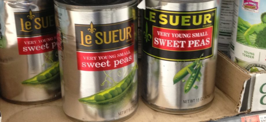
Unfortunately, the company is changing the logo, with a new look for Le Sueur, and it is not good. In the picture here, the new logo is at left, the old at right. Granted, the new logo has a retro feel, and perhaps they are harkening back to packaging in the pre-1970s era, as the brand is over 100 years old. But the can to the right, which is the classic version (always on a silver label) has the feel of establishment quality. There is nothing “cute” or “retro” about it, it is serious good eating for prosperous Americans, and that’s it.
Companies that tinker with a product that is already perfection put the product at risk unnecessarily. In the case of Le Sueur, they have also introduced all sorts of spin off versions over the years, including a version with mushrooms and small onions in it. I bought it accidentally, and it was awful. I think it also changed the taste of the peas, which began to ruin the brand. I am not sure when the spin-off arrived. Also, I have not seen advertising for Le Sueur, either point of purchase or TV. This needs to be rectified, with the new logo of course.
General Mills is a smart company, and I have no reason to think they will completely mess up Le Sueur. But one does need to watch out for these things, as brand managers wishing to make a name for themselves can sometimes do great damage. As we have said before, a great brand moves to a point of perfection where it does not need to be tinkered with. Play with spin offs, new launches and the like, but leave the original alone and original.
J. Garland Pollard IV is editor/publisher of BrandlandUSA. Since 2006, the website BrandlandUSA.com has chronicled the history and business of America’s great brands.
Never mind the label, now they have changed the peas! They are larger and taste like crap! We’re donating the rest of the cans we bought to a food pantry!
I agree that General Mills is indeed messing up the LE SUEUR logo. I clearly remember the old logo from the late 1960s because my mom bought plenty of cans of these peas at Food Fair in Old Bridge, NJ (the town where I grew up in the 1960s and 70s). They were and still are the most delicious peas. I ran to two supermarkets today right after I got your email and at the second supermarket I was able to buy the last three cans of LE SUEUR with the great old 1960s logo. The rest of the cans are with that new logo which I do not like. I will put a call into General Mills and let them know that there is no reason to mess up this great brand with the creation of a new logo that fans of LE SUEUR do not like or recognize. Some hot shot brand manager is sadly screwing up this brand when the old logo should be left as it is because it is perfect and does not need a new logo.