 NEW YORK – Part of the whole point of branding is to teach that as a company, you want to get to the eternal, the brand that never changes, the brand that customers trust and suppliers fight to sell to, the brand you never need to advertise because it is so well-known and trusted that it sells itself.
One of those brands is Metropolitan Life. Through its history, Metropolitan Life has been a beacon of stability in millions of families’ lives, what advertising called a “Light that Never Fails.”
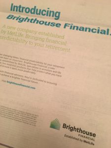
So it was with great surprise that I picked up The Wall Street Journal and saw that Metropolitan Life would, well, no longer be Metropolitan Life. It would instead spin off its life insurance, its reason for being, into a new company named after my local cable company, which was called Brighthouse, and now is called something else that I cannot remember.
This is sad, as Metropolitan Life was once one of the great things of capitalist America.
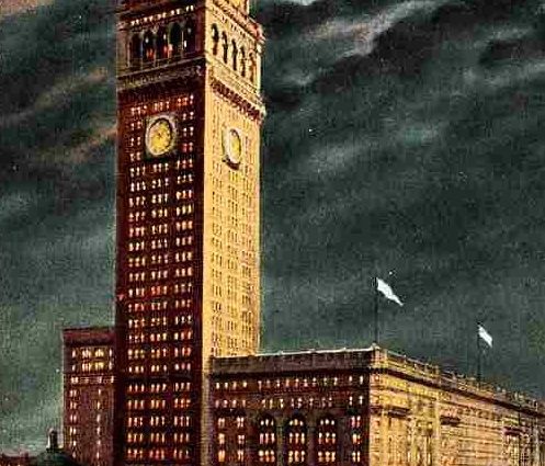
The American Skyscraper, Cultural Histories by Roberta Moudry tells a bit about the self view of Metropolitan Life through much of the 20th century as it relates to the famous 1909 Metropolitan Life building. Met Life, as it has come to be abbreviated, was all about providing security in families lives. Granted, this idea was a sort of marketing construct, but it was a good marketing construct, a construct that was implemented and followed through on by hundreds of thousands of agents and clerks.
Moudry writes of how Metropolitan Life saw itself through a poem:
We’re the guardians of the Tower
And the light which it enveils
It’s the symbol of our power
To its height no other scales
For its grandeur and beauty
Will teach to each his duty
To be steadfast and loyal
To “The light that never fails.”
The current Brighthouse ad, however, has a different message. First of all, the house in the logo is green, as if any house in the world, other than perhaps a camp cabin, is green. Secondly, the light is radiating out of the house, not into the house. Thus, the consumer is the ultimate provider of “light” and sort of has to heat themselves in a cold, green house. The metaphor for a green house is not good. In a literal greenhouse, you have to try to keep the sunlight in, as there is so little sunlight in the area. Greenhouses are for cold areas, where there is not much sunlight. Green means environment for some, but in a house, it means algae!
Then, the fine print adds:
“Product guarantees are solely the responsibility of the issuing company and not MetLife. Met Life, a registered service mark of Metropolitan Life Insurance Company, is used under license to Brighthouse Services LLC and its affiliates.”
At the end of the fine print, there is a number L021748990[exp0419] to which there is no explanation. Does the guarantee expire on 4-19? Does the guarantee that it is not product guaranteed by MetLife expire then? I am not sure what it all means. I think what it means is to read the fine print REALLY CAREFULLY if you get anything relating to a MetLife policy.
Of course the overall message coming from MetLife is a bit confusing, as the Met Life logo sits atop the sideways airplane wing that is the former PanAm building above Grand Central Station. And the new version of it looks rather like another brand, Diffen, whatever Diffin is.
The new version of the MetLife logo is equally yoogly, a sort of rancid blue and green, making a sort of bulbous “M” that reminds me of a bad 7th grade art color wheel. I think we had one from Creative Playthings back in the early 1970s; sister took it when she “ran away” to the area between the pine trees and azaleas in our house in Virginia Beach.
The other logo, of the “M”s of the 70s, was quite good, actually, and sort of hip, in a 1970s way. Now, it looks so different, it seems to be a different company.
The explanation is equally insipid. And I guess it is a different company.
“To remove the complexities traditionally associated with insurance, MetLife is making substantial changes to its customer experiences. The MetLife brand refresh will ultimately impact all customer touch-points from the website to customer service to its sales process to ensure a more focused, simplified interaction. “We are embarking on a journey to upend the long-entrenched norms of the insurance industry. We are focused on humanizing our industry and designing every customer experience to reflect the modern company we’re becoming,” said Esther Lee, global chief marketing officer of MetLife. “Throughout our nearly 150 year history, we’ve always played a very important role in our customers’ lives. Today, we’re evolving our brand to express this important role – our noble purpose – to be the trusted partner to help our customers navigate their changing worlds.”
So we have gone in a progression of absolving responsibility:
- Golden era: Early Metropolitan Life slogan “Light that Never Fails.” means that the light was provided by the company. Ads had largely featured the salesmen of insurance, who were representatives of that light in a stormy universe of uncertainty.
- 1980s: Back in the 1980s, “Metropolitan Really Stands By You” was the theme. The idea? Metropolitan was alongside you. And it “really” stood by you. Really! But there was no light, and MetLife was aside you, along the way.
- Snoopy era: Spend millions on Snoopy blimp above drunken attendees at sporting events. Take your logo and put it atop another big building heretofore associated only with a failed airline.
- 2017: No more Metropolitan, in name, or in guarantee, but they still have “established” this Brighthouse Financial to sort of stick by you, except that MetLife is more about selling corporate benefits, and doesn’t guarantee anything.
Frankly, the norm in most people’s lives is that they need protection for their families in case they die! They don’t a “journey” to “embark” on “designing every customer experience.” I don’t want a touch point, I don’t want to hear about a “noble purpose” when the original “noble purpose” has been spun off.
The press release also explains that they dropped Snoopy. First, most consumers don’t care that MetLife dropped Snoopy; many younger Americans don’t hardly know who Snoopy is. Secondly, that Snoopy would help sell life insurance was probably not a good idea in the first place. And third, that once you have a mascot, to dump it is to further confuse the consumer, who puts himself in the place of the mascot. The message:
If they will dump the mascot, perhaps they will dump me too! And at least Snoopy was cute and reminded me of Christmas specials.
Goodbye to another great American institution. It was one of the greats.

