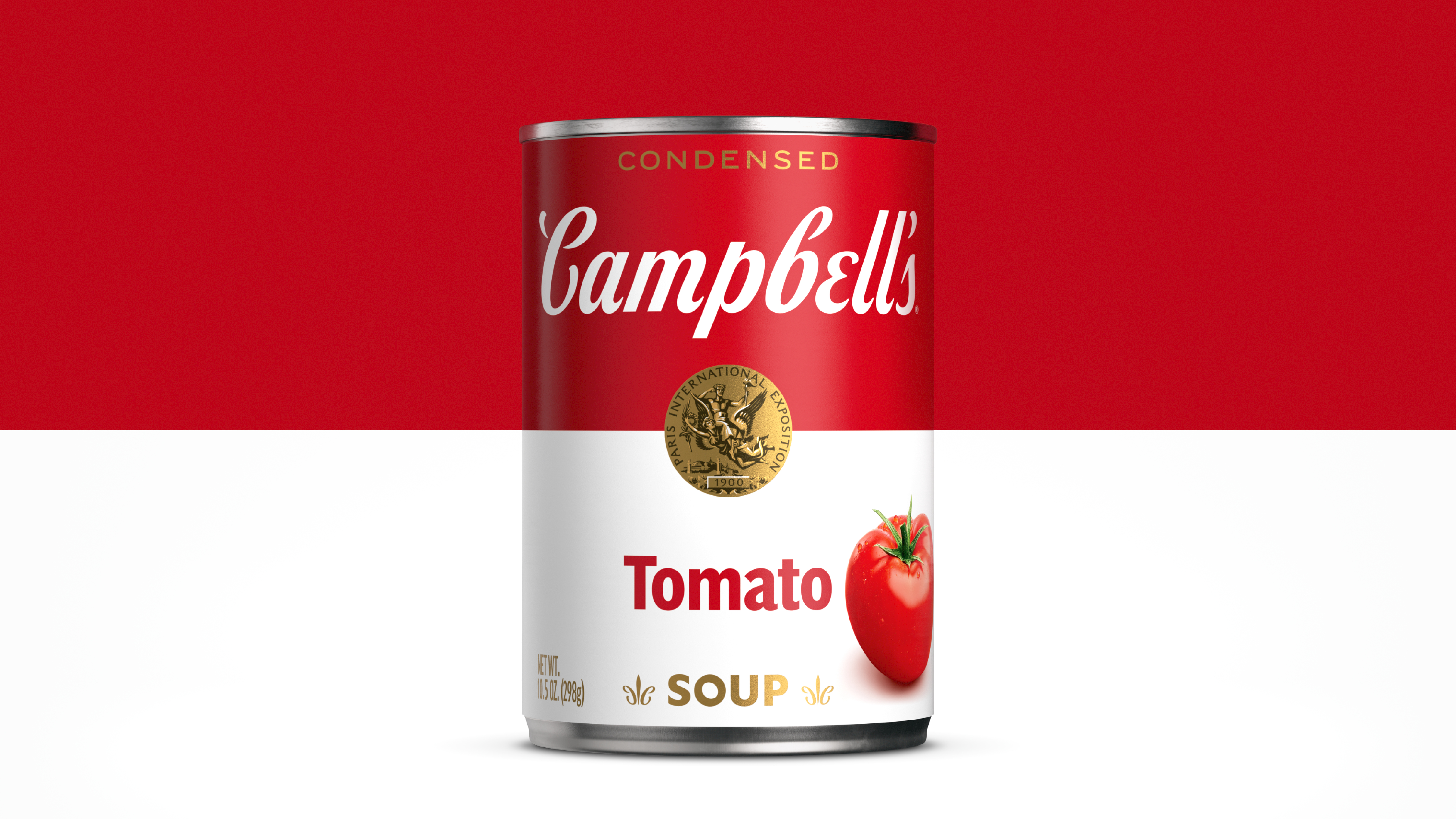
NEW YORK – Campbell’s Soup has a new can design that looks updated, but still resembles that familiar and beloved kitchen staple that Americans love.
“We’ve been on a journey to re-imagine this iconic brand and appeal to new generations of consumers who are cooking at home more than ever, while still honoring our rich history,” said Linda Lee, chief marketing officer, meals and beverages, Campbell Soup Company, in a release.
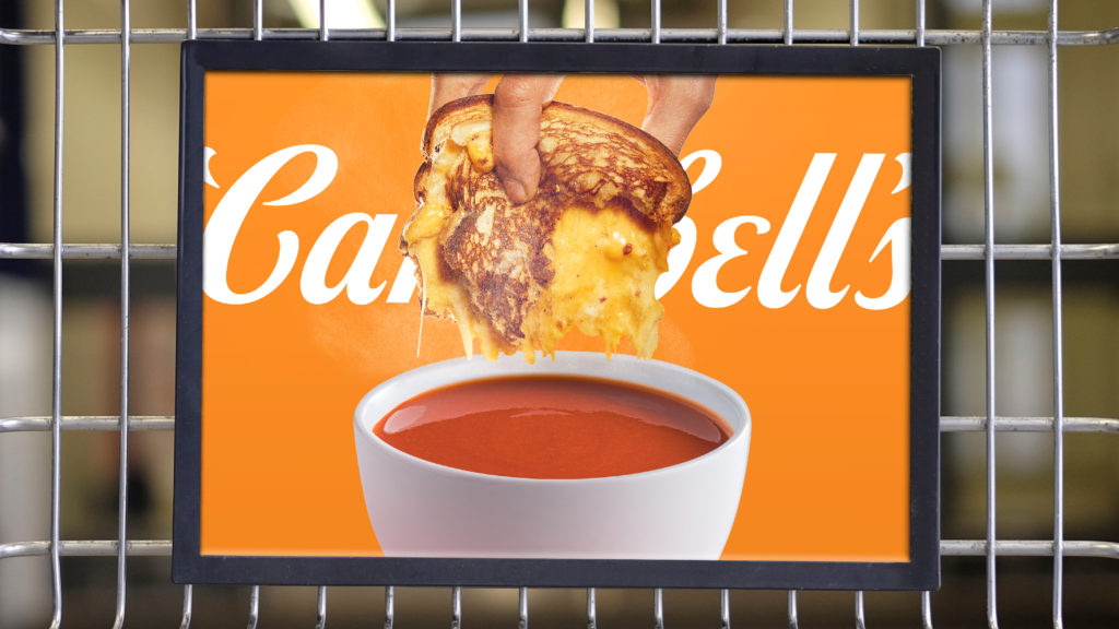
The refreshed logo and packaging system celebrate the original design, while keeping it fresh on grocery aisles that are increasingly cluttered with new entrants.
Campbell’s tapped Turner Duckworth, a design and brand agency with offices in London, New York, and San Francisco, to handle the project. The agency’s work include McDonald’s, Subway, Little Caesars, Burger King and Coors Lite, among others.
Kitchen Staple, Museum Crowd-pleaser
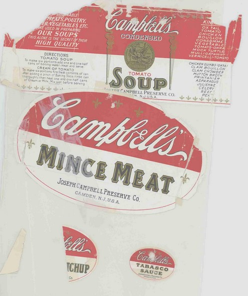
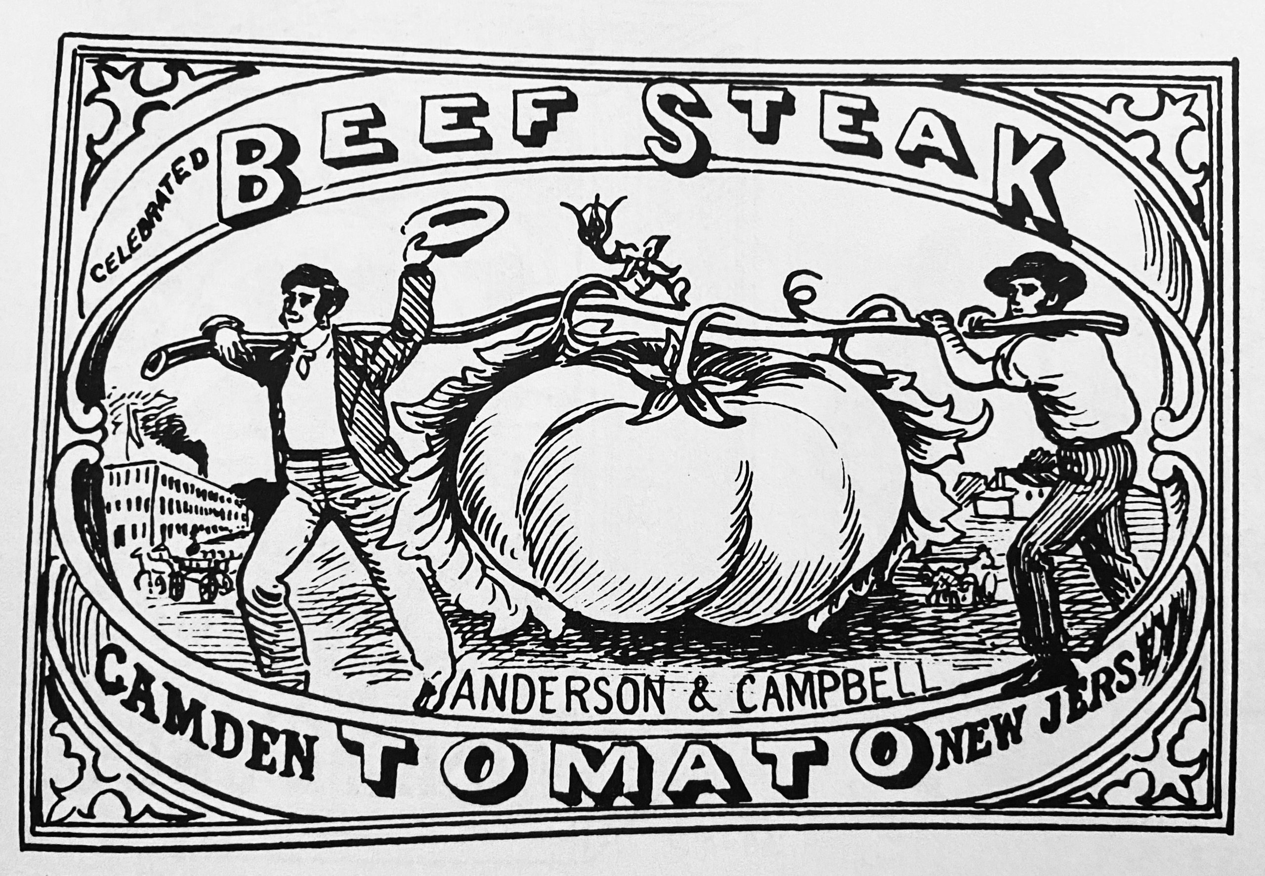
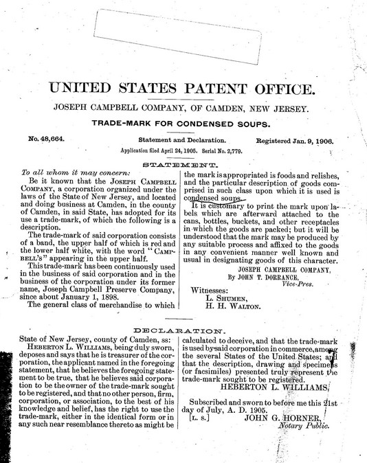
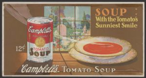
The red and white Campbell’s Soup can is among the best known and best loved consumer products of the U.S. On the Campbell’s Soup trademark award certificate (seen below in slideshow), it says that the predecessor Joseph Campbell Preserve Company had used the red and white can beginning about January 1, 1898. The actual tomato soup was earlier. The Campbell’s website timeline shows their Beefsteak Tomato soup on the market in 1895. That can did not have a red and white band, but it did have a picture of a tomato.
In the 1986 Penguin/Steam Press book Symbols of America, writer and brand historian Hal Morgan notes that Campbell’s colors were inspired by Cornell football uniforms. Around 1902, the medal on the can was the National Export Exposition of Philadelphia, but at some later date, the medal at center became the Paris Exposition of 1900.
Artist Andy Warhol made the cans into a work of art in the 1960s. The Phaidon The 20th Century Artbook summed the work up by saying that “In mass producing images of everyday items such as this soup can, he questioned both authorship and the validity of uniqueness.” Today, Warhol Campbell’s images are in many great art collections, including the Museum of Modern Art. While many graphic designs can be considered works of art, there are few brands that actually become the art. Campbell’s has understood what Warhol did for the brand; the company even released a Warhol series of can designs in 2012, to celebrate the 50th anniversary of the first paintings at Los Angeles’ Ferus Gallery. (Other companies with Warhol connections have not used the notoriety to their advantage, ie. Warhol’s Brillo.)
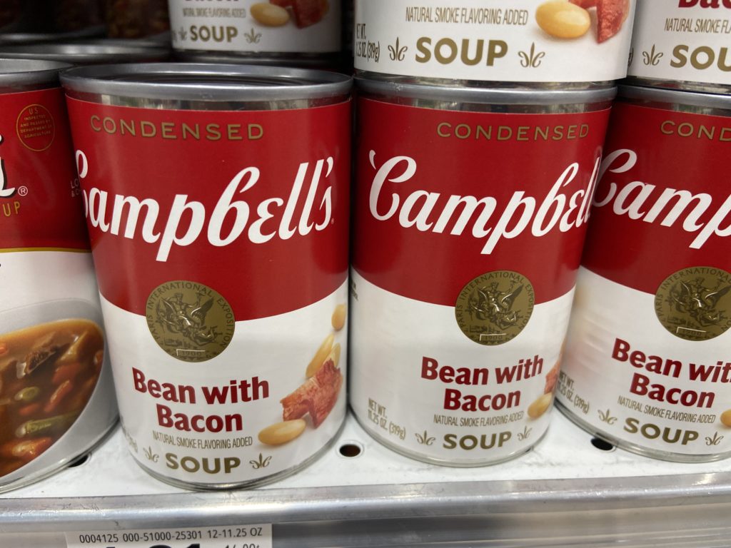
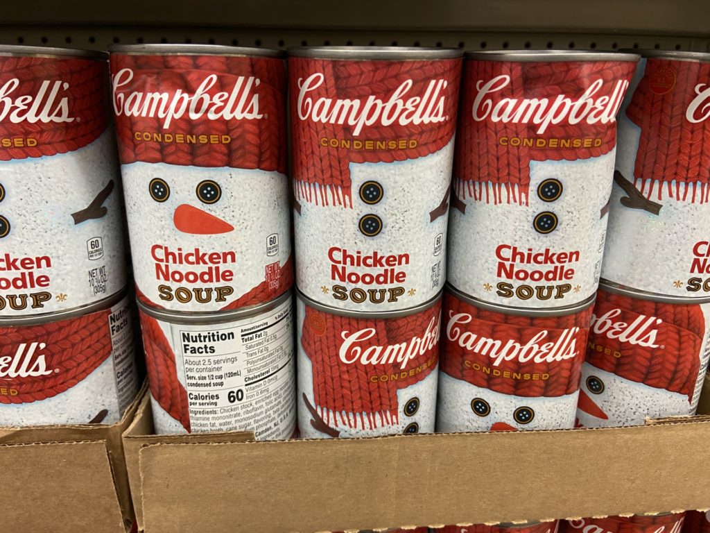
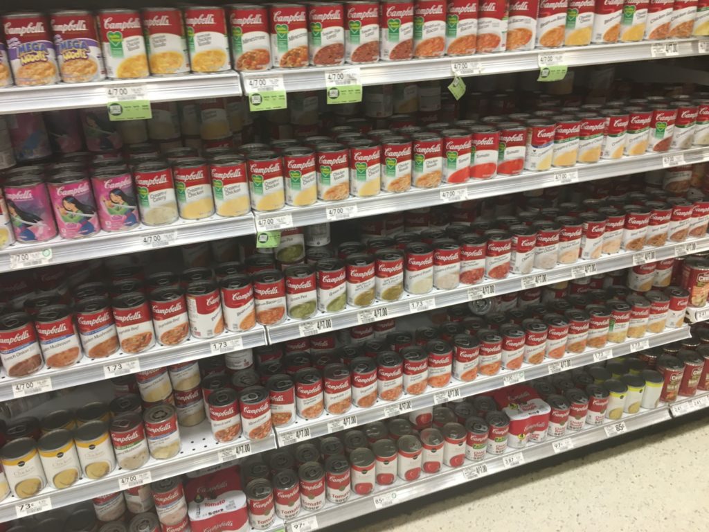
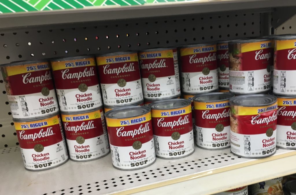
Through recent decades, Campbell’s cans have adopted swooshes, ribbons and big undifferentiated bowls of soup to differentiate the now over 100 products bearing the Campbell’s name. The Tomato and Chicken Noodle designs remained mostly untouched, a nod perhaps to purists or regular fans, but the entire effect was confusing. In toto, it looked like a cluttered shelf.
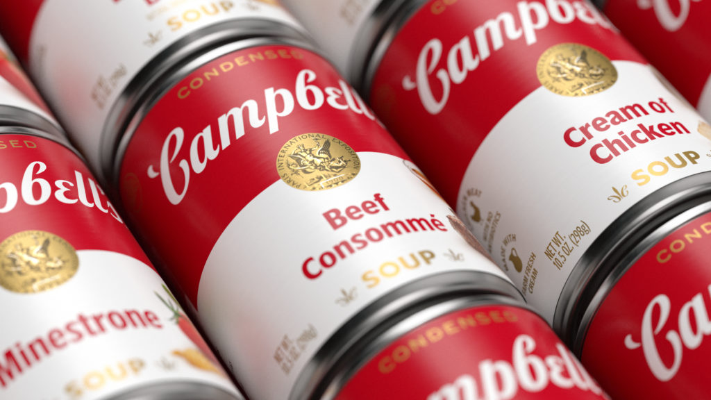
In the redesign, Turner Duckworth went back to the red and white split of the can as the central departure point while redrawing the entire portfolio of products. The red and white color split is essential, an actual part of the original trademark for Campbell’s Soup, registered Jan. 9, 1906. Then Vice President John T. Dorrance wrote that the “trade-mark of said corporation consists of a band, the upper half of which is red and the lower half white, with the word ‘Campbell’s’ appearing in the upper half.”
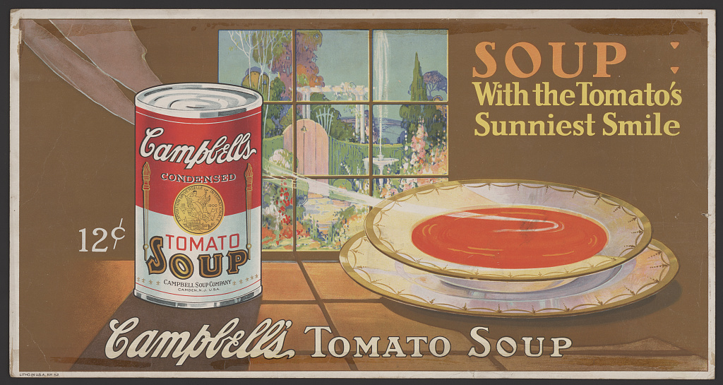
The redesign added vegetable photos on the new packages that echo the pre-red and white product cans.
Keeping the Colors
The logotype modification was a challenge because Campbell’s Soup is not only a part of what makes Americana, it is both a product brand and a corporate brand. It had to stay updated, yet not change at the same time.
Typographer Ian Brignell based an updated script font on founder Joseph Campbell’s signature. To make it easier to use digitally, the script letters were separated. A new fleur-de-lis borrows the C from the script in an effort to reinforce the brand. In previous versions, there were multiple fleur-de-lis along the bottom of the can.
“While it’s still a close reference to Joseph Campbell’s original signature, the new script gives us the ability to condense, expand and function in any medium, a nod to the elasticity of condensed soup,” said Andy Baron, the agency’s executive creative director.
There is also a bigger visual identity package to go along with the product design, including bands and signage.
“The Campbell’s name itself brings a sense of nostalgia and comfort,” said Drew Stocker, Design Director, Turner Duckworth.
Below, some views of Campbell’s through the years.
- A separate Q&A interview with Drew Stocker, Design Director, is HERE.
- A BrandlandUSA story of brands connected to the late Andy Warhol is HERE.
- Below, a slide show of some views of Campbell’s through the years:

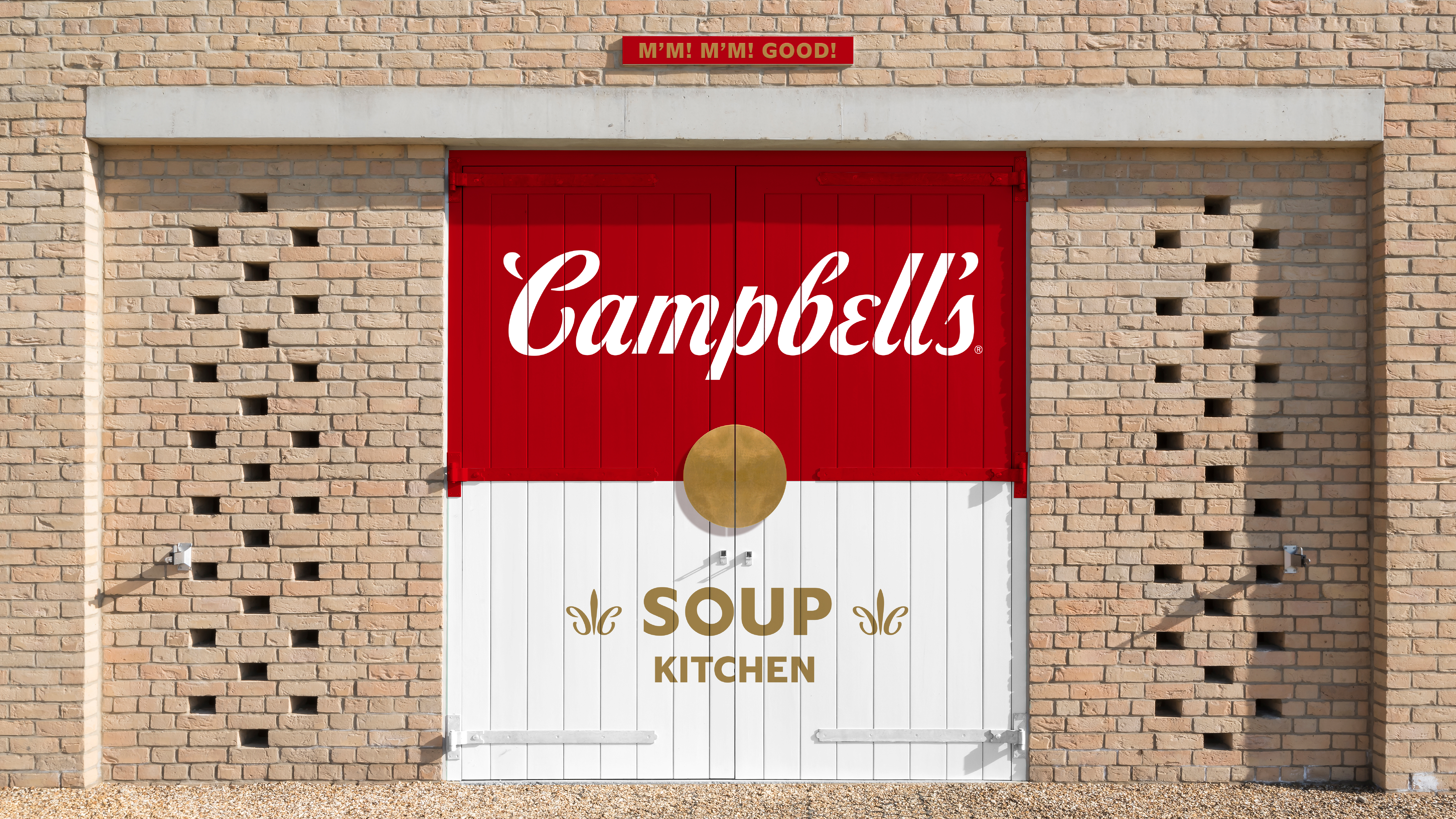
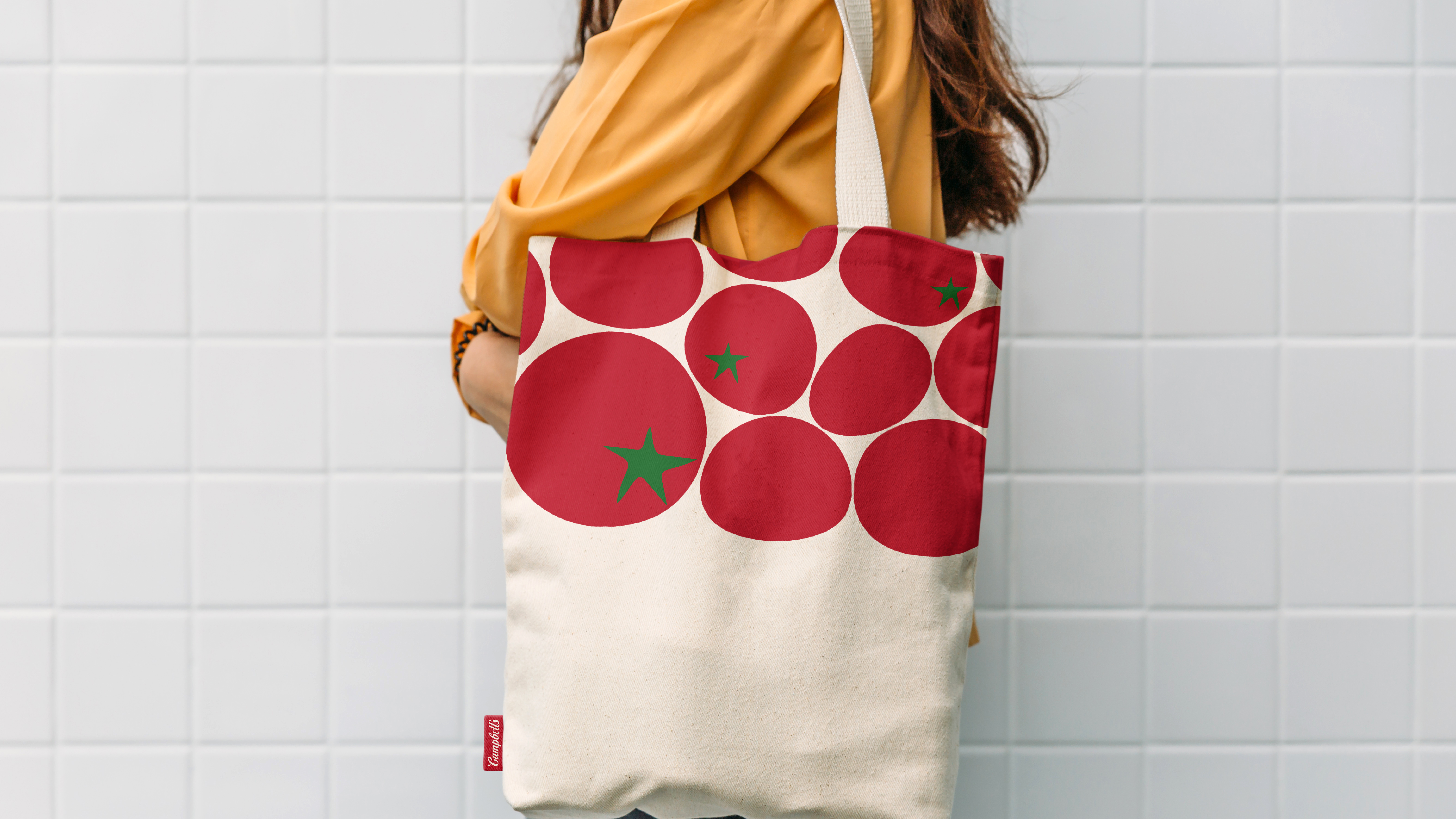
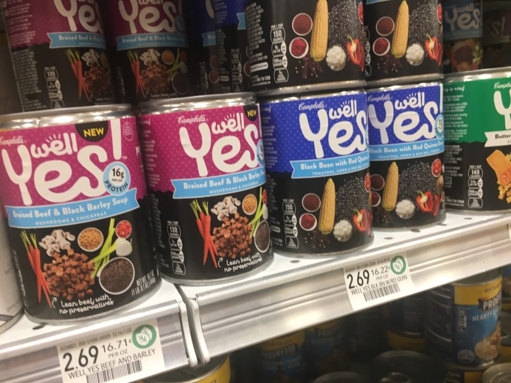
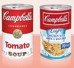
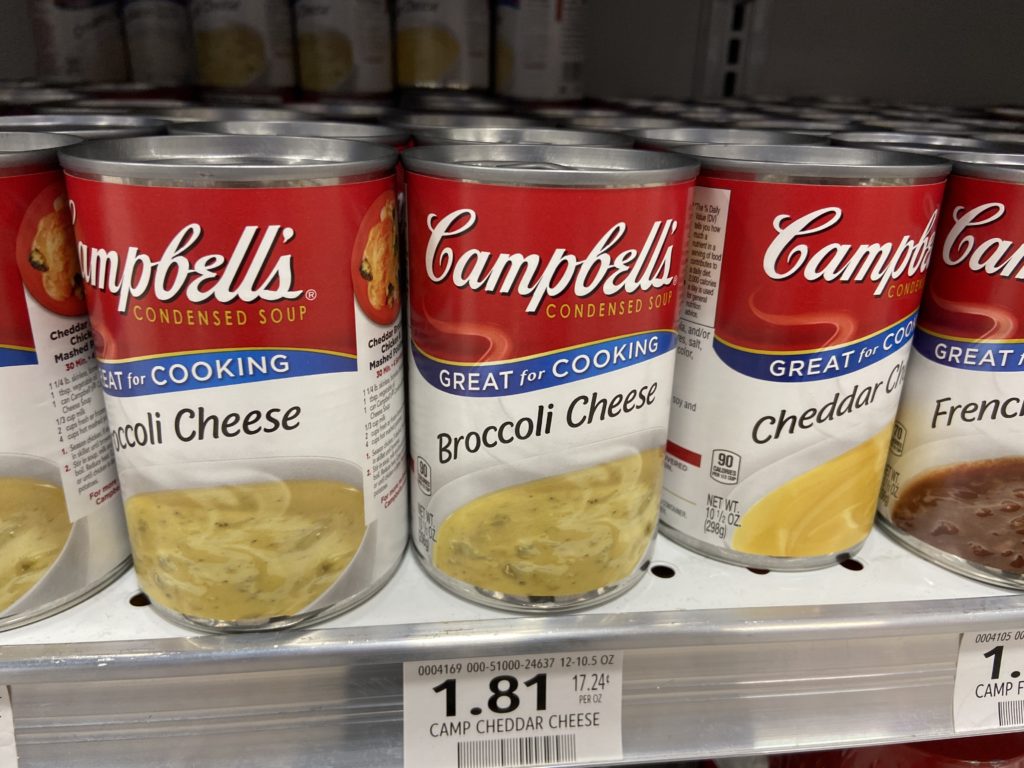
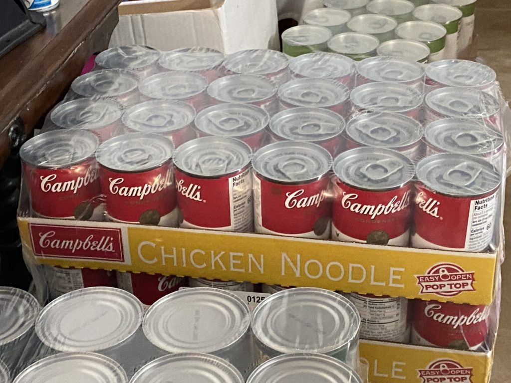
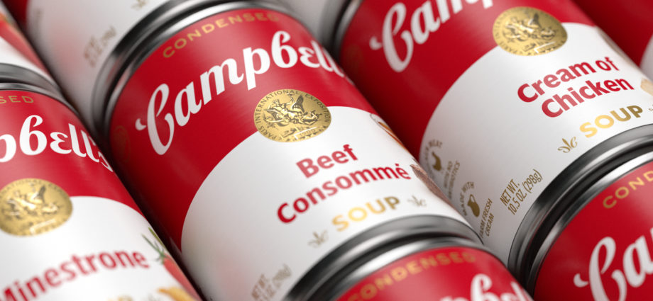
The new design, with small product images at right. Early labeling from the United States Patent and Trademark Office files. A close up of the new script from Turner Duckworth. Current version of the classic tomato soup. Can you tell the difference? One main addition is the tomato. Paris Exposition medals have been a key to the design. Beef Consomme in the new packaging. Packaging as featured in signage. The classic design used in a public building setting. It wears well. Campbells on a tote back. Earlies logo from Anderson & Campbell of Camden, New Jersey. Campbell’s Soup promotional image from 1920 to 1930, from the collection of the Library of Congress. A special promotion design from previous years. Full array of Campbell’s in a grocery before redesign. The swoosh on the Campbell’s can was expected to increase sales, but the collective presence of the brand lost its punch when seen in toto. Campbell’s Well Yes is a new version of their soup. From a decade or so ago, their light line. The swoosh design, from a trademark file at the USPTO. Old Broccoli Cheese. A previous redesign had eliminated the classic top of the can. A less useful design for Chicken Noodle at Dollar Tree. Classic Chicken Noodle is an item loved by every demographic. Here, the soup as given away in a Bradenton, Florida food pantry at St. George’s Episcopal Church.