There were very few good things that came out of Britain’s unfortunate dalliance with socialism after World War II. The one thing that was good was the British Rail logo.
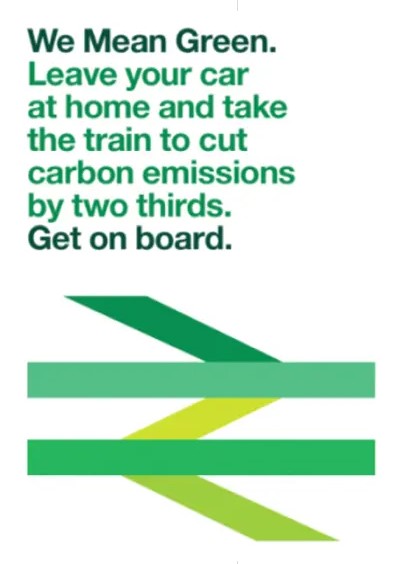
But there is news that the U.K. government is updating the British Rail identity, turning the logo different shades of green. The whole thing reminds of “New Coke” where perfection was ruined.
For generations of Britons, that simple and elegant track logo symbolized the history and legacy of trains in the U.K. But the symbol does not just belong to Britain. It was and is a worldwide marketing symbol for Britain, and is loved in America, too through the Britrail pass, sold by thousands of travel agents here.
Remember that the double tracks came to popularity in the U.S. at a time of Paddington Bear and Upstairs Downstairs. In that 1970s era, U.S. travel to Britain boomed, and the logo, and the requisite Britrail Pass, became the chosen tool to see Britain. It was a bargain, and enabled generations of travelers, and college students, the ability to explore the entire country.
Americans were never terribly intrepid travelers, and the U.K. was always a good foreign destination because it was overseas, but spoke the same language. The ubiquity of the British Rail symbol in that context meant that whenever you saw it, as a traveler you knew that there was a place in each town, the British Rail train station, connected to your safe and pleasant journey.
Because of T-shirts, the Underground symbol is known by most Americans, many of whom have never been to London. The Britrail tracks, however, are known by people who actually have been to the U.K.
New Look Rubbish
The logo is so good, so simple, that Britons are wondering why they are changing it. Social media posts are hilarious, with new slogans like “Our logo doesn’t matter. it’s not like anyone can afford it.”
The Guardian reports that the government calls the new look “a single familiar brand with a bold new vision for passengers – of punctual services, simpler tickets and a modern and green railway that meets the needs of the nation,” A green propaganda type version of the logo was revealed this week. Immediately, critics pounced, including the 82 year old designer Gerry Barney, who worked on the British Rail branding back in 1964.
“I think that’s rubbish,” Gerry Barney told the Guardian. “I could understand it if they had just swapped red for green. But why on earth have they got that many colours? It’s a load of old bollocks. It’s just a mess.”
Post War Design Excellence
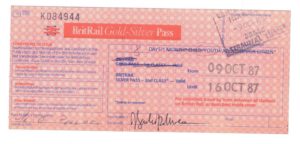
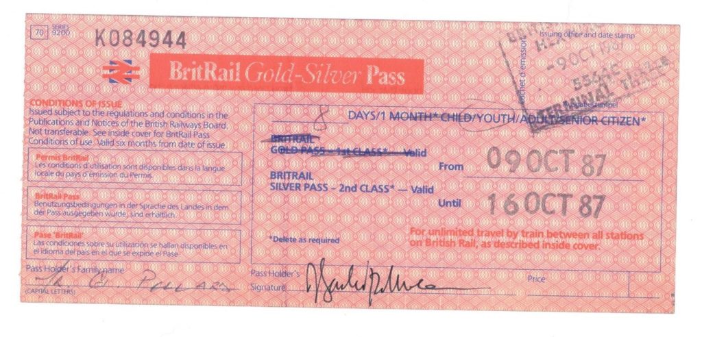
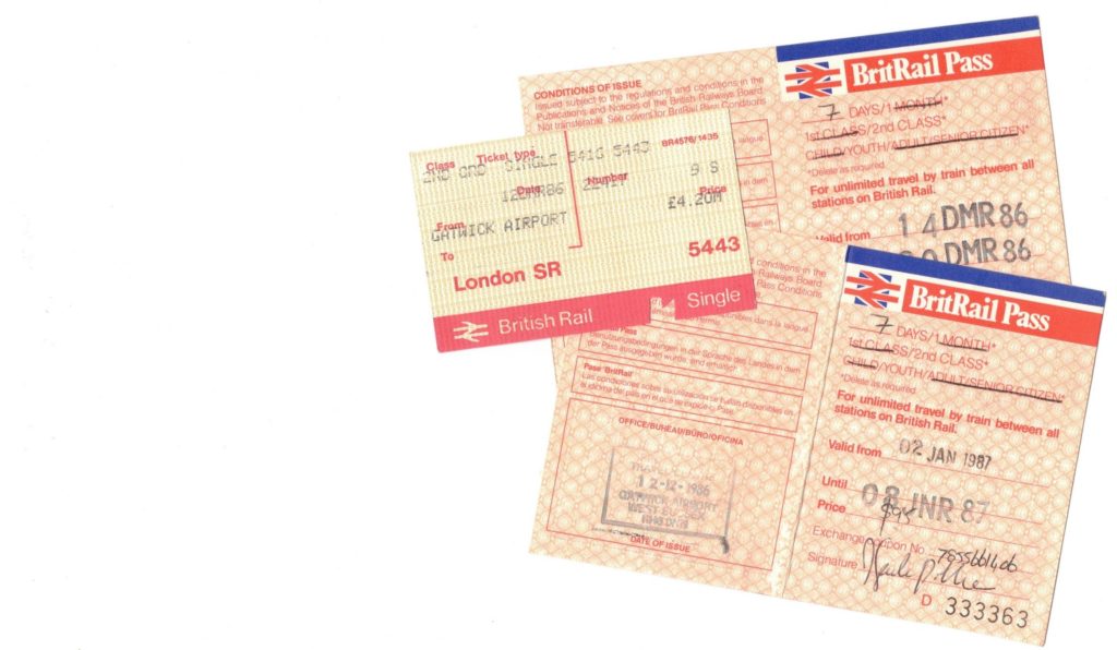
A 1980s version of the BritRail Pass.
The logo was a product of the Design Research Unit, founded in 1943 in London. The company had roots before World War II, with the Bassett-Gray Groupp of Artists and Writers, founded in 1922 by Milner Gray and Charles and Henry Bassett.
After the war, the group reorganized, adding Marcus Brumwell and Herbert Read. The company, according to Charlotte and Peter Fiell in the Taschen book Industrial Design A-Z, designed new products for the post war British economy, including TVs, heaters and all manner of industrial products, including Ilford film and cameras.
British Rail officially dates from 1948-1997, and came after the nationalization and merger of the Great Western Railway, the London, Midland and Scottish Railway, the London & North Eastern Railway, and the Southern Railway. Americans will know these names from movies and art posters, especially the LNER and Great Western.
In the U.S., this process resulted in the Amtrak passenger rail brand.
The entire corporate identity for British Rail dates from about 1965, and it helped to unite a fragmented that group of rail lines that had all had independent identities. When the British government privatized passenger service on British Rail, old railroad brands were revived. The British Rail identity survives as the logo for National Rail, the overarching company that operates 33 different railroad operating companies. The logo is owned by the the government.
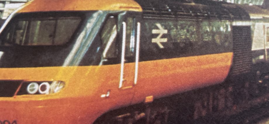
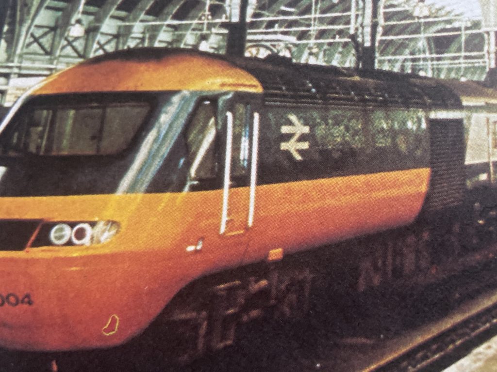
The track logo for British Rail is associated with innovations like the InterCity 125. Today, the government is in the process of launching high speed rail, and perhaps the green logo is a bit of green-washing, as there have been protests at the destruction of landscape for the new trains.
The logo works, so why mess with it? And in a time when the culture may not even have a male James Bond 007, what else of popular Britain will the culture lose?
“I don’t know if it can be updated, it’s so simple,” Barney told the Guardian. “They should just leave it well alone – if it ain’t broke, don’t fix it.”
Below, advertising from British Rail using the logo as it was shortly after launch. Below that, an ad for the Intercity 125, with the logo on the main engine. At bottom, the logo in use in multiple settings, including the Britrail Pass.
The identity works well on multiple documents.
Intercity 125, the British Rail innovation of the 1970s.
Britrail and other tickets from the author’s scrapbook.
A promotion recently had multiple shades of green.
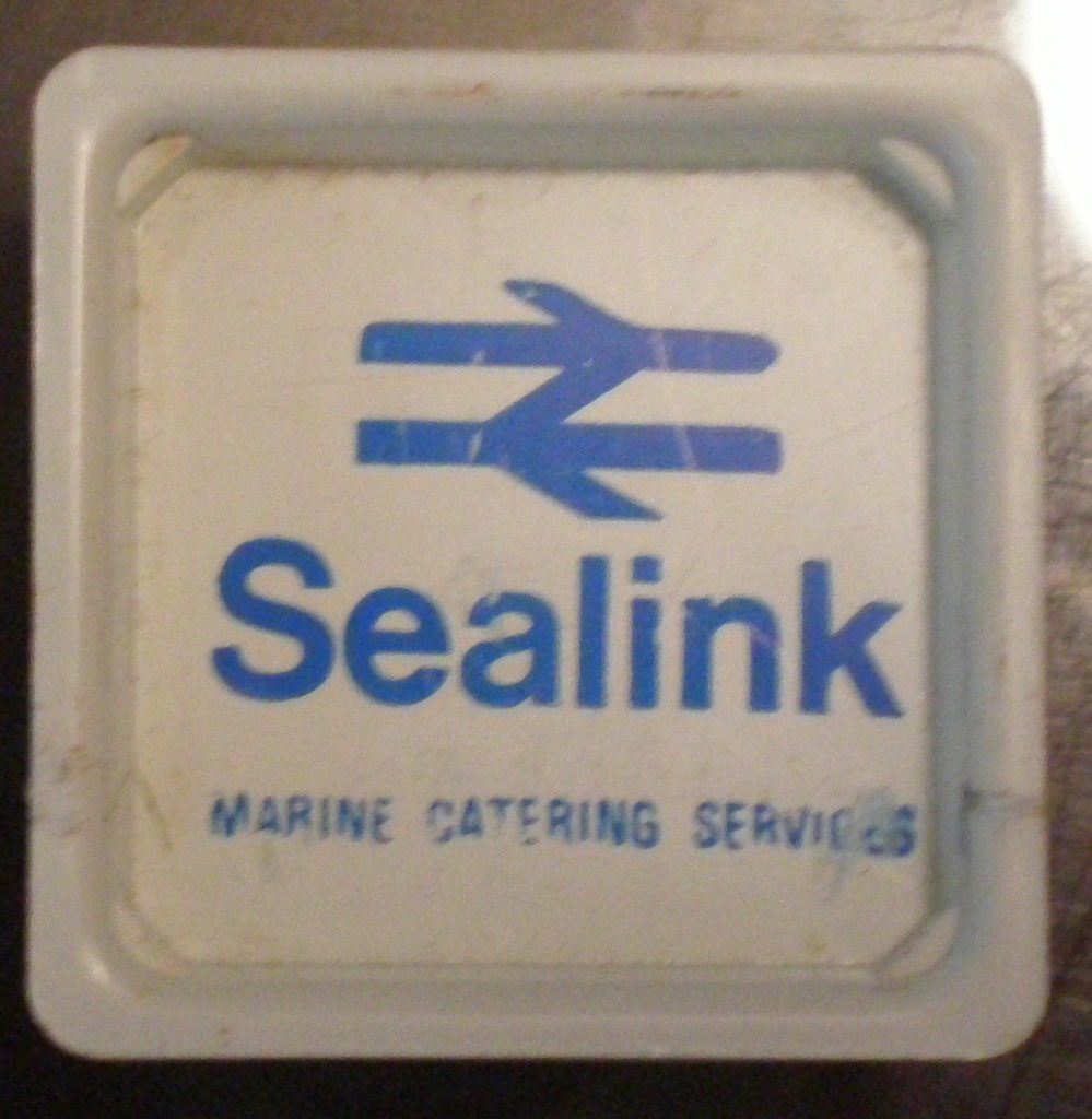
Sealink Marine Catering. It even works well on butter containers from Hoverspeed.
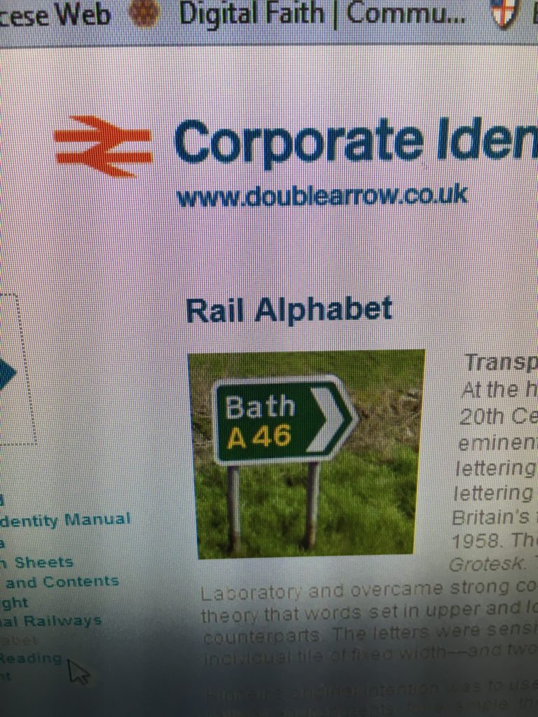
Corporate website branding from earlier this decade.
J. Garland Pollard IV is editor/publisher of BrandlandUSA. Since 2006, the website BrandlandUSA.com has chronicled the history and business of America’s great brands.


known around the world ? i’ve never seem that logo in my life, and i don’t think it’s passing will be lamented.