When you look at consumer items, or any sort of item designed or sold, there are certain rules brand managers and product designers need to follow. One such rule is that the product name should always appear on at least one side of the package, so consumers can store it on its side.
These sorts of product rules are mostly by custom, sometimes by code, and are always by experience and habit.
In a political ad, the candidate must indicate at the end that it is approved. A financial solicitation must have a disclosure. A pharma ad must have a warning. A pill bottle must have a child-proof top, and the pills themselves must have a look and color and numbering unique to only that product, so as to prevent confusion by the pharmacist, and to aid in catching drug smuggling.
For other trades, there are also rules by custom (and later code). In a book, the title on the spine should run from top to bottom, though wider books and reference books sometimes get a pass, as there is room to go sideways. In a radio ad, there should never be horns, as many are driving while listening. TV anchors should not wear stripes, as it makes a shiny effect.
Some things turned from custom into code. In a sink or shower, the hot needs to be on the left, according to the Uniform Plumbing Code, a legacy from the time that there were two knobs. Automatic transmissions must go P-R-N-D-L, though manual transmissions, which are sadly fading, have not always had an exact pattern, especially as there were “Three on the tree” vs. “four on the floor” with neutral in different places.
In computers, and keyboards are, by custom, QWERTY, a legacy of the typewriter era. For a time, most consumer headphones all had a three-terminal tip-ring-sleeve (TRS) connector that was 3.5mm, referred to as 1/8″, until Apple ruined things.
The idea of packaging labels on the side often gets lost. In recent years, it has become so easy to change packaging, the custom is sometimes lost. Also, today there are so many other things that need to be on packages, not just ingredients, but UPC codes and nutrition charts, which seem to take up more and more space. One other factor is the competition for shelf space. In the discussion over what the product front looks like, the rest of the design falls out of importance.
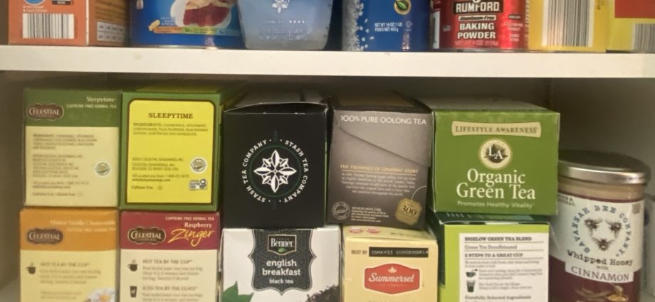
Pictured above, a selection of teas on a shelf. There are four packages from Celestial Seasonings. Others include packages from Stash Tea Company, Lifestyle Awareness, Bigelow Green Tea Blend and Twinings Oolong. There are also Aldi’s Summerset camomile and Benner English breakfast store brands. All of them have side package labels.
There is no downside to not having the name on the side. It only needs to be at the top, somewhere, in a font large enough to be seen, but small enough to allow for other things. Looking at the tea lineup here, it becomes clear not only that you need package names on the side, but the brand and the type of tea should be clear.
Shoe manufacturers get this; shoe boxes need to be seen by their ends, with sizing and other information, because they sit on shelves with the long sides parallel. The situation is made clearer because either a rushed sales clerk must find the size and the brand, and/or the consumer is looking for the size and the brand in a self service aisle in a place like DSW.
Not everyone has one dimensional refrigerators or cabinets. Often, products need to sit on shelves on the side, so that consumers can see what is in them without pulling them out.
If you don’t believe us, Chat GPT has an answer, as well. Make what you wish of it.
The side of the package should complement the front design and provide additional necessary information, such as the product’s ingredients, nutritional information, manufacturer details, and additional product features. It should also be easy to read and understand, with clear and legible font and graphics. Additionally, it should align with any legal requirements for packaging labeling. Overall, the side of the package should enhance the customer’s experience by providing relevant information and reinforcing the front design’s visual appeal.
There is no downside to putting names on the spine of a product. In fact, there are other places where product names can and should appear, including with jars, on lids and tops, and even embossed into the glass, so the brand can live on in posterity in archaelogy.
Products in rounded shapes, with no sides are of course exempt.
Product Design Examples
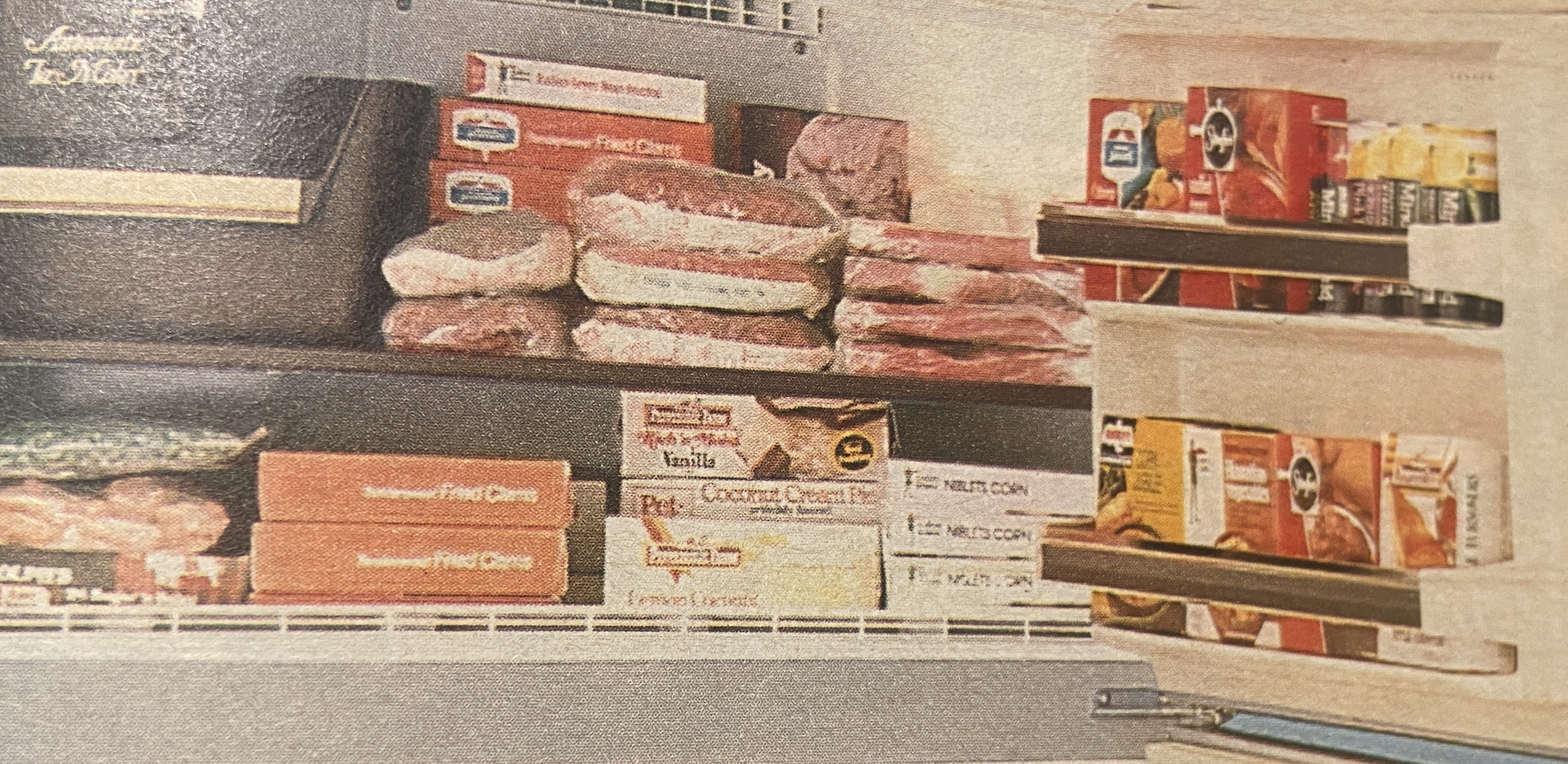
Below, a few views of various grocery packages inside a Kenmore refrigerator from the Centennial 1986 edition of the Sears catalog. Note that round products like Minute Maid frozen orange juice, of course, are exempt from the rule because they are, well, round. Square freezer items are fairly good about showing the product name on the sides; the tight size of a fridge freezer, and the stability of some vegetable brick packages like Birdseye, keep the label in its proper place.
Kenmore freezer section from a 1986 Sears catalog. Note that product fronts are O.K. in the door, where space is narrow. But other frozen items like Pepperidge Farm cakes and Green Giant Niblets Corn can be seen when they are on their sides.
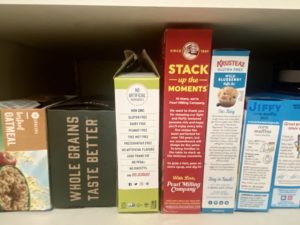
Below, a drygoods shelf, where absolutely nothing is stored frontways. Note that Jiffy, which is one of the most consistent brands on grocery shelves, has a clear brand name at top, in familiar blue. The other side of the Jiffy includes a bit about the company, so there is no way you would miss it. Pearl Milling Company, aka Pepsico’s Aunt Jemima, has their brand name at the bottom, which is not ideal, especially for a new launch. Krusteaz has a clear name at top, with a use suggestion, as the consumer, searching on the shelf for something else, will have their eye go to the Krusteaz, and then see the muffin suggestion.
Two packages without side brand names are two newer products, evidence of a less experienced designer. Kodiak Oatmeal, in a handsome package from the front, has only a slogan on the side with “whole grains taste better”. It also offends by having the writing sideways, and bottom to top, which is different than books. The package does, however, stand out, but that has nothing to do with the package issue. Ditto with Skinny Pop sea salt popcorn. The package tells us that there are no artificial ingredients, but it does not tell us the product name, or suggest a use, as do the others.
Remember the BrandlandUSA maxim, heard here first: The package front sells; the side tells.
J. Garland Pollard IV is editor/publisher of BrandlandUSA. Since 2006, the website BrandlandUSA.com has chronicled the history and business of America’s great brands.

 Forgot Reopens in Cumnor, Va.")
 Forgot Reopens in Cumnor, Va.")


