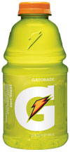
 Please make graphic designers stop.
First Pepsico does a number on Tropicana, and then this G for Gatorade. Annoying. Can we not just make the product and sell it? We keep seeing it on the shelves and tried to ignore it.
Certainly, the new design is tasteful. And we have to allow a company to change with the times. The lightning bolt is OK too.
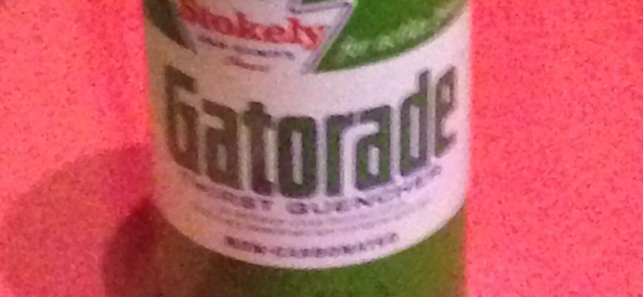
But we do miss Stokely Van Camp, though we know that’s a goner a long time ago. And we understand you can’t have it in a glass jar.
The great Wacky Packages parody advertised that it was “Made from freshly squeezed alligators!”
We disagree with Kulturblog. We hate all the redesigns of all the PepsiCo products. They are way too cool for school.
Pepsico has lots to say about the design, but we do find it confusing.
 We don’t expect PepsiCo to do a mea culpa like Tropicana. They’ve had enough of sword-falling for the year. But we do wish at least one product would just be what it is, and companies would spend time selling it well.
Sarah Robb, I don’t want to be invited into the brand, thank you! I just want to buy it.
We know they like us talking about it, even though we don’t like it. But we still like what’s inside. At least they didn’t change that.
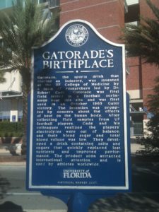
Pictured here, the Gatorade sign in Gainesville, Florida, its birthplace.


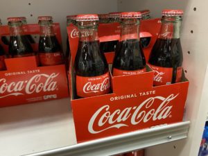

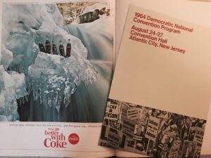
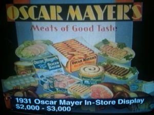



There was more color and design appeal back when we had to pay a per-color charge. Now that most everything is printed digitally, and 16 million colors is the same price as 2 or 4 colors, seems everyone wants ugly white space and simplistic design. YUCK. It makes the product seem generic.
Also, when a company changes their packaging drastically, it gives me the idea that the product inside has changed as well, and that is not appealing to me.
Sarah your new G logo is ugly! It doesn’t make me think anything has been taken to the next level. Instead, it makes me think that you’ve ruined the product familiarity. Who ARE these new breed of graphic designers? WHY do they think that mucking around with great original graphics is a great thing when it only cheapens the image of the classic product?
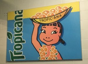
Tropicana don’t even get me started! It turned my formerly favorite orange juice into a junky looking plasticized mess of packaging and labeling. I don’t even buy it now.