 Why did Kraft turn General Foods into scrap?
This week Kraft Foods (NYSE: KFT) revealed its new logo in a ceremony at the Consumer Analyst Group of New York Conference in Boca Raton. It is, according to Adweek‘s report, to differentiate the product brand Kraft from the company brand Kraft. Please read the article in Adweek to see the logo as I can’t look at it I am so upset.
That is a bit of an exaggeration, but frankly, I find the new logo confusing. Kraft unwisely ditched decades years of brand equity when it dumped the General Foods corporate brand, and now it confuses customers again by changing the look of the familiar Kraft logo. What a waste of effort.
General Foods was a great brand, with a perfect, classic logo, and it was used mostly as a corporate brand, not as a product brand.
Writes Adweek‘s Elaine Wong:
The latest logo, however, is an attempt by Kraft to distinguish between its corporate and product brand identity. In a recent interview with Brandweek, Kraft chief marketing officer Mary Beth West said the company felt the need to redefine its mission…
Hey Mary Beth West! As logos go, your new Kraft logo by agency Nitro isn’t bad, and we are glad they got some work out of it, but we just wonder about the whole strategy. But here’s a little secret that you missed. Nitro could have tweaked the classic General Foods logo, and been done with it.
But no, this is what we get:
“In some ways, this really is all about Kraft Foods. It’s about our next step in the evolution of getting ourselves to top-tier performance. Going forward, it defines, unifies and simplifies our employees and gets everyone thinking about one common purpose,” West said.
We don’t understand why Kraft is doing this sort of thing; they are doing brilliant work with their Kool-Aid brand, and so many other products in their company are getting back on target. It’s just that they are missing the boat by sending General Foods to Alang.
But Kraft doesn’t have it all correct. The Wall Street Journal reported that Kraft CEO Irene Rosenfeld is pursuing a “top brand” strategy that tries to ensure that its brands are at the top of their category. This strategy is off base, as it imposes a one size fits all strategy on all brands, whether they are mega-brands like Kool-Aid and Jell-O or third-ranking brands like Post Cereals. Post Cereals have for decades been a more “adult” cereal brand; for Kraft to think they needed to be General Foods or Kellogg’s is a grievous mistake in understanding what Post is about. We hope Ralcorp (NYSE: RAL) will be better stewards of the Post brand.
But, that is to be expected from a company that could not figure out how to market brands like Postum in a time when health-conscious eating is the height of chic. While the stuff tasted weird, it had a niche following and brand extensions could have kept the line viable. What’s next, dumping or selling off Tang?
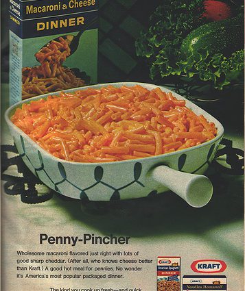
General Foods was a brand that was known to consumers as a master brand to numerous product brands like Tang, Maxwell House, Oscar Meyer and the like. Read our post on the unwise dumping of the General Foods name entitled Where is General Foods?
Frankly, they would do well to scrap the confusing Kraft identity, and go back to General Foods. Kraft is a dairy and refrigerated brand, and there is no getting around that. The “elephant” in the room in Boca Raton was actually a big ole mama cow, with giant teats, that was moo-ing something else, namely that Kraft is an excellent CONSUMER (not corporate) brand that decades of advertising has associated with C-H-E-E-S-E. That Kraft doesn’t get this is weird.
There is no getting around it. Kraft does not spell F-O-O-D-S. It never will. Kraft does not spell a great consumer products company; I don’t infer this. I was taught this by my wasted childhood in front of American network television. Instead it goes like this:
“America spells cheese K-R-A-F-T.”


I am fairly new here and wasn’t aware about the Kraft logo change until today (4/13/11). I’ve seen this logo on internet based Kraft information and web sites. Every time I’ve seen it, I’ve asked myself why is Kraft using this feeble graphic in lieu of their classic logo? This isn’t a logo, it is some graphic artist’s attempt at artsy and expressive. Let’s hope this just fades away.
One cannot say it often enough:
Do not fiddle around with your logo!