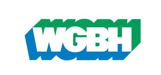
 BOSTON – WGBH is the most noted high-culture brand in the United States. Yesterday, they changed their logo to a cutesy, street nickname, GBH.
WGBH’s television programs, syndicated by the Public Broadcasting Service across the U.S., were and are cultural landmarks as well-known as Boston’s Old North Church. WGBH brought us Masterpiece Theater, American Experience, Frontline, Zoom, Evening at Pops, This Old House and The French Chef, among dozens of others. Their This Old House invented a new format; they were “reality” television well before for-profit television debased the format and made it trite. The WGBH identity they carved, through their actions, was expressed in a snazzy electric synth logo that came before each show, that turned into “WGBH Boston.” When you saw the WGBH logo, and the music, you knew a quality television program was to follow.
Yesterday, they ditched some of that brand goodwill, in favor of a nickname. They dropped their W, to just become GBH. It would be as if BBC renamed itself Beeb, or The Washington Post suddenly changed its masthead, and called itself “WaPo” in all its marketing. A Reddit poster summed it up perfectly, by comparing it to Dunkin’, which dropped their Donuts.
The Educational Boston Landscape
WGBH (the GBH part is for Milton’s Great Blue Hill) is remarkable in that it was and is not only the leading PBS station, but the station that helped actually create the identity of PBS. Let’s go further. WGBH invented PBS. Just after World War II, everyone called PBS stations “Educational” for National Educational Television. What station did my grandparents watch Upstairs Downstairs episodes of Masterpiece Theater on? It was actually on PBS station WCVE Richmond, but they called it “On Educational” as if it were not an adjective, but a noun.
While there were and are many programs that make up PBS, the WGBH shows were the most popular nationally, and had crossover appeal to general audiences. When they succeeded, others copied the WGBH model, including all of cable TV, which is rife with one-hour documentaries.
As the station’s influence grew in the early 1970s, it hired the noted design firm of Chermayeff & Geismar (now Chermayeff & Geismar & Haviv) to craft a new logo. The new logo would identify the station in a genius way; its animation would bring attention to the authorship of WGBH at each of these national programs. The intro signature “Sting” music for the logo had been composed earlier by musician Gershon Kingsley. Kingsley is known as the composer of the Moog synthesized hit of the sixties, Popcorn. You may not know the song by name, but if you want that earworm back, feel free to Google it.
Below, the Chermayeff logo. It is genius. One could watch it over and over again.
Chermayeff was, and is, one of the best graphic design firms in the world, responsible for the identities of Chase, the Smithsonian, Pan Am, NBC and others. Their work, widely imitated, is about good taste, redacted design, and powerful symbolism. Their work for WGBH, coupled with the Kingsley sting, gave each program an identity as clear as an MGM or Universal movie.
When you saw the logo, and heard the sound, you knew that there would not only be a watchable program, but it would be to high standards, and ideals of decency. WGBH’s Chris Pullman, now retired from the station, explained the overall WGBH brand, and why it worked, in a post with Design Observer.
“It occurred to me that in fact variety itself can be a kind of consistency. But when the visual expressions of a company are always and rightfully different, you have to have some other constant that binds the work together, something that lets individual expressions be different, but makes them recognizable as a family of related materials. The goal in this game is to strive for the smallest number of constants and the largest number of variables. And you have to turn to non-visual sources of consistency.”
Because the shows were for different audiences, the strength of the WGBH brand made you trust the other programs. This is key to an entertainment brand; each program is not just a one-off, but the brand helps you know that there are other programs that you might like.
The logos of individual stations were important to PBS; indeed Chermayeff designed the PBS logo, seen below.
Through the beginning of PBS, stations were like small movie production houses, each trying to offer programming that would not only uplift viewers, but bring positive attention, and donors, to the station. While Washington’s WETA was mostly known for news shows (Washington Week, PBS News Hour) and Maryland offered Louis Rukeyser’s Wall Street Week, the only true rival to WGBH was New York’s WNET, producers of shows like Live from Lincoln Center, Great Performances, Nature and American Masters. Other stations also produced shows that were shared by PBS (Mister Rogers Neighborhood was from WQED Pittsburgh, sponsored by Sears).
Boston, City of Good Television
At the beginning of public broadcasting and educational radio, the there was a sort of openness about programs. Different stations around the country created programs that reflected their locations. They were almost an ad for the culture of the place. In economic development circles, these stations were high local prestige; even better than a symphony or sports team, the programs of WGBH advertised Boston as a place of sophistication and intelligence.
Because of WGBH, Boston sort of owns public television as an idea, just as Nashville owns country, Hollywood owns films, and New York has Broadway. Sesame Street might be in New York, but the great content of PBS is Boston. The reality is that for over a half century, WGBH has been a beacon for the showing off of Boston as a city of national importance that is larger than life, and not a second city to New York. And they project the identity of Boston; ageless Kevin O’Connor is from New Jersey but no matter, he looks Boston.
In announcing the dropped W, the station said:
“For nearly 70 years, the W in WGBH’s call letters reflected that it was a broadcast licensee east of the Mississippi River (while most licensees on the west side have call letters beginning with a K). But with more than half of its audience impressions coming via digital platforms, the public media pioneer dropped the “W” to better reflect its leadership in the new media environment.”
An understandable thought, but unnecessary. Through the years, the embracing of the Boston (and New England) identity of WGBH has rendered nil any concept of the W’s and K’s of broadcasting. WGBH is an uber-media brand, and it gets to dictate the geography, and the technology. Indeed, in this era, no one really pays attention to the call letters much anymore; they are merely a fact. At some point, the people at WGBH might think that they are sort of bigger than a mere station. The reality is that what makes them powerful is that they are a station, and they have a core New England audience that supports their station values.
In the press release, they were sensitive to the old identity, even as they were ridding themselves of it. They wrote:
“The new logo retains the look of the iconic ‘drop shadow’ that Chermayeff & Geismar originally designed in the early ‘70s. The font will change to the clean and modern Red Hat, which functions better digitally. The iconic audio mark, also known as the sting, or the sound that audiences hear at the end of GBH-produced content, will not change. The new primary brand color will be a vibrant, digital-first shade of purple. Equality, wisdom, empathy, creativity and resilience are all associated with purple and align with GBH’s core brand values.”
The logo change was done by a regional ad agency, Minelli. It works fine as a nubbin icon for their YouTube channel, but that’s it. The response on Twitter, which is hardly a final verdict, is negative. I could not resist posting this:
Guess I will be adding the WGBH logo to my modernist logo graveyard, alongside old UPS, old Yale University Press, and – yes – the Hartford Whalers. Glow in my heart, old WGBH logo. pic.twitter.com/Ao6q8BJexh
— Brian Goldstein is thinking about post offices (@bgoldst) August 31, 2020
There are several reasons why it is a not a good choice.
-
- First, there is no reason you can’t use GBH in some marketing materials, or even as a sub-brand. People can always call the station GBH, if you happen to think it is clever. So you don’t have to change the main identity to do that. It’s not clever, but if you think it is clever, then you do it that way.
- Second, purple? Really? No need to explain why that is wrong.
- Third, there is no reason why it matters about W or K or any station lettering nomenclature of the FCC. The Daily Mail is still the Daily Mail. The Telegraph is still the Telegraph. Tribune/ Nextstar’s WGN just launched a new national newscast on WGN America (not GN). What if they rebranded as GN, saying that folks west of the Mississippi thought broadcasters were all Ks? That would be foolish, as the audience knows them as WGN. Screen Gems? Well you don’t see them on screens, so call the studio Gems? What is this obsession with changing a name when the tech changes. When you do that, you lose the legacy, and the narrative. CNN is now a media brand too, and only partially delivered by coaxial cable.
- Fourth, while the Chermayeff logo is not some sort of God, it is very good. As God pronounced in Genesis, “behold, it was very good.”
- Fifth, they have set a bad precedent by renaming Masterpiece Theater, renaming it Masterpiece. Same principal here. Of course, there is no theater!
- Lastly, changing names confuses people. You lose continuity. People just don’t pay that much attention to logos, and when they change, people lose that continuity. And the brand goes. You can build it back, but it’s slow, as you have lost a compact with the customer.
Below, the first Zoom episode on WGBH. Note that it predates the Chermayeff logo, and shows the 70s obsession with Helvetica. As always, Boston is in the loop, as is the W.
WGBH did a New Coke. But it was worse in this situation, because they did not change the Coke name. And in fact, Coke is named for cocaine, so there’s that little bit of history and confusion.
There is time to reverse course. If you are active with WGBH, call Darlene Marcos Shiley if you know her, and tell her to get on the phone to Jon Abbott, and tell him to switch it back before some other company decides it has to change their great brand, too.

